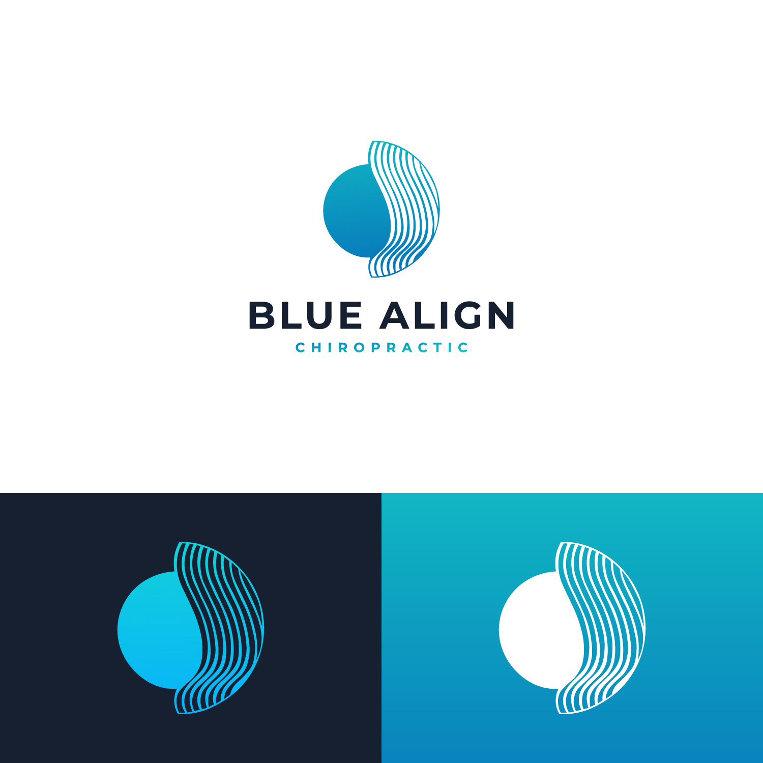
Blue Align Chiropractic

Want to win a job like this?
This customer received 146 logo designs from 77 designers. They chose this logo design from Clean Designs 2 as the winning design.
Join for free Find Design Jobs- Guaranteed
Logo Design Brief
We require a logo for rebranding a chiropractic business, to unify 2 offices under the same name, rather than location.
I have tried several designers and haven’t quite got there.
Blue Align Chiropractic is a holistic chiropractic approach that includes energy therapy.
We aim to Align a person structurally and energetically. We do this with a unique combination of techniques.
Our ultimate purpose is to Align a person to their spiritual purpose. This is the most powerful Wellness outcome.
The Blue Zones are the most successful populations in the world in terms of longevity, health and quality of life. These populations are well researched, and probably the most important factor in their amazing heath outcomes, is life purpose and connection.
Blue Align represents the intersection of ancient wisdom and modern science creating unlimited potential.
Blue is the color of the throat Chakra which represents the full expression of an individual through divine guidance.
Attached are some of the previous work.
I have always liked the 2 circles intersecting – which can represent: spirit and body, Ancient wisdom and modern science etc.
I have attached the documents with the different stages of the designs. I like the 2 circles but it just not there.. Its not powerful enough, and there is something about the intersection that doesn’t look right.
AS the design evolved lines for energy were added, but in the process the circles were lost, and it just got too busy.
I like the idea of Organic with Sacred Geometry. And more of a notable intersection- The problem with a star etc in the intersection can be peoples religious beliefs- I don’t want it to be divisive or look religious.
I hope someone can help !!
Logo Text
Blue Align Chiropractic