Rebrand for new company group
Want to win a job like this?
This customer received 193 logo designs from 74 designers. They chose this logo design from design_by_sandro as the winning design.
Join for free Find Design Jobs- Guaranteed
-
 €110
€110
-
 193 designs
-
 74 designers
Logo Design Brief
Rebrand for new company group
[Update]--> As most submissions look very much alike it is a fault of the brief.
What we like the most about our current logo is that the text part looks hand made and unique. It looks sharp and crisp and has its own identity.
Each part, icon and text must be able to stand alone and make sense.
The icon that supports the text part of the logo just fits well and was not something that we requested, now some people have gotten used to it.
I think that the "N" that is inside the leaf shape representing sustainability is very well suited for that letter, making it looks like the sign for infinity (with some imagination) representing circularity.
I am not sure that the leaf shape is so well suited for an "X", most important is those parts mentioned above, the quality and that it ends up being better or at least similar in terms of quality.
[End of update]
We currently have three companies with three different names, logos, URLs etc.
(This is just copied and pasted text from the document uploaded which includes some additional images)
Moving forward we have taken the decision to not rebrand the acquired companies under our current name; NRSE and instead rebrand under the following name; XLNT Group.
Each company will be renamed XLNT in the following format as we have different niche markets but operate within the same business sector:
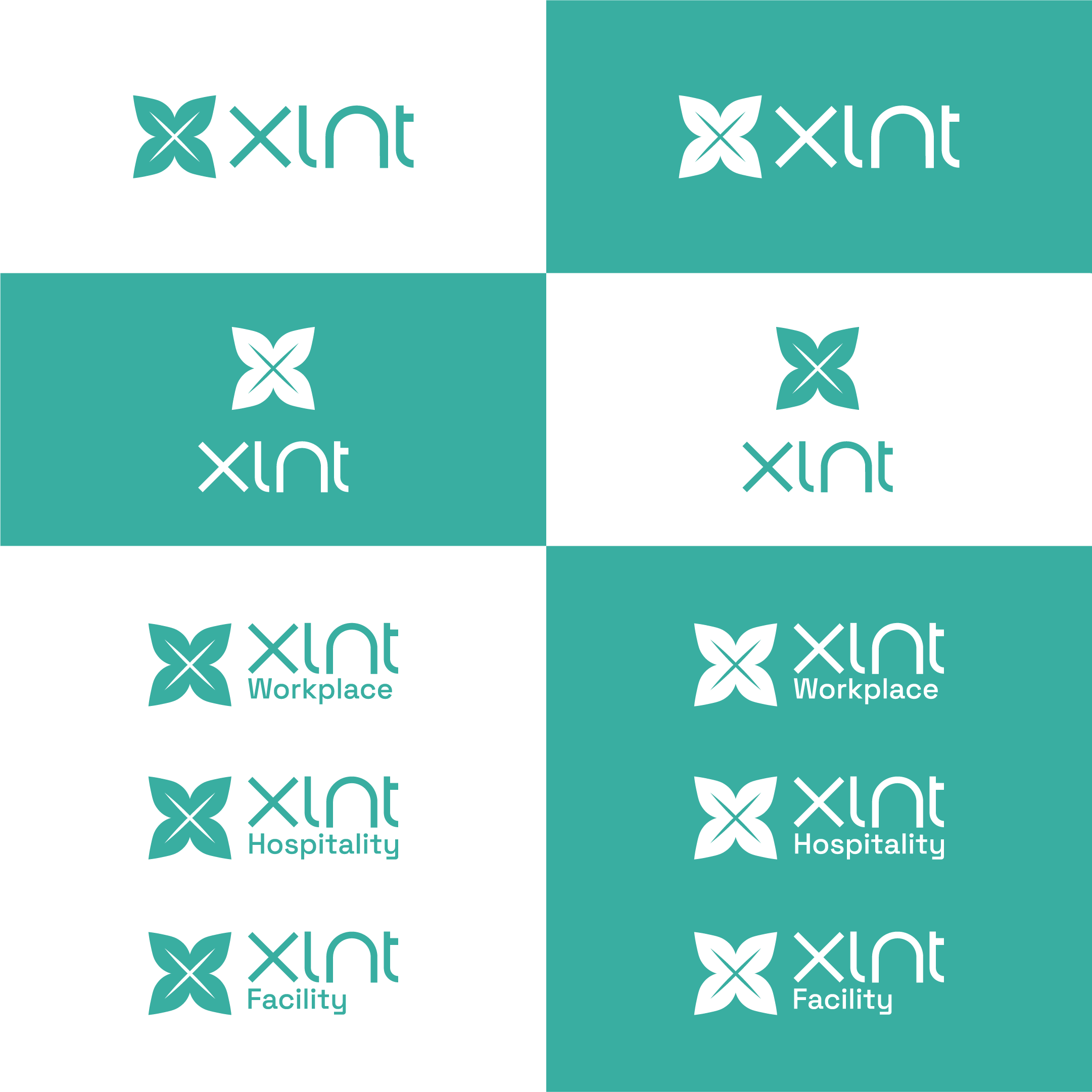
XLNT Workplace (currently NRSE)
XLNT Hospitality (currently Exellent)
XLNT Facility (currently XLNT)
All three companies are engaged in the Facility Management sector, specializing in soft facility services.
While there are no immediate plans for further acquisitions, it is a possibility and if that were to happen we will most likely integrate them in the same branding framework.
This could mean either merging them with our existing operations, depending on their market specialization, or establish a new niche under the XLNT umbrella; XLNT -[Niche]
Some background/context
Our industry (Facility Management) is large but quite anonymous and lacks identity, in that context we are a modern, innovative company.
We have always been sustainable, but the pillar is most likely the level of quality and service delivered.
Look & Feel
Visit our current sites for style reference:
NRSE: https://nrse.se
Exellent: https://exskan.se
XLNT: https://www.xlntallservice.se
Colors
#39AEA1
Font pair
Main: Space Grotesk
Secondary: Poppins
Inspiration
Most straightforward approach will be to look at our companies websites.
NRSE has been our main website, moving forward we intend to use one main website for all companies, namely XLNT Group, each company will have its own subfolder and the only thing that will distinguish the companies “logowise” will be their niche positioning.
Most likely, if you don’t have a better idea, it will follow the same structure/variation we have today for the NRSE logotype.
Both for XLNT Group and all XLNT companies.
Logotype requirements
It shouldn’t be too hard to read or comprehend what the logo says.
It should fit our current look & feel.
Please refrain from using 3D-mockups for the presentation as it just makes it harder to evaluate.
Logo and icon
Meaning it will have to have elements to it so that it can be used in different ways depending on the platform and purpose ; favicon etc.
Size/ratio
250 x 100 px
Nice to have
We like our current logotype, but it’s easier for us to change the name to XLNT as the two acquired companies are pronounced the same way (excellent) already.
If it is possible to somehow utilize the icon used for the NRSE logotype and make it make sense and fit with the new logotype it would be nice as long as it does not limit the creative freedom.
The main goal is to create a new and more appealing logo that fits our current look & feel.
Target Market(s)
B2B, private companies
Industry/Entity Type
Facility Management/Facility Services
Logo Text
XLNT
Colors
Colors selected by the customer to be used in the logo design:
Look and feel
Each slider illustrates characteristics of the customer's brand and the style your logo design should communicate.
Elegant
Bold
Playful
Serious
Traditional
Modern
Personable
Professional
Feminine
Masculine
Colorful
Conservative
Economical
Upmarket
Requirements
Must have
- An icon and a text that spells XLNT either in small or capital letters
Nice to have
- Well made proportions for the text, looking crisp and sharp and not like a normal font. The icon and text should fit together, it doesn't have to look exactly like the old one, most importantly is that it fits well together, it's just that some people have come accustomed to the old one, but that doesn't necessarily mean that it is the way to go. Also it would be nice if the text would look clean on its own and have some identity.
Should not have
- The old icon, just as it is, or the "X" made into a swastika