FitSapiens Studio- repair, sport and lifestyle training
Want to win a job like this?
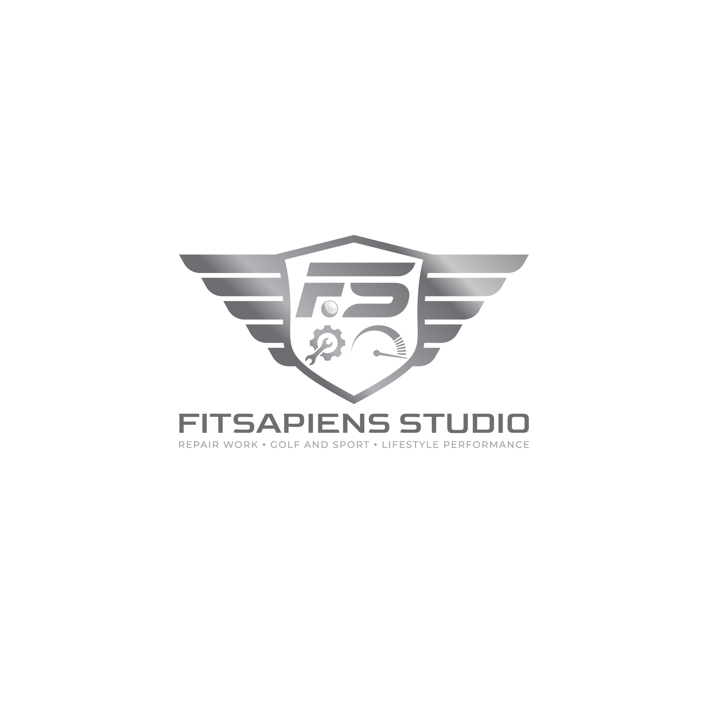
This customer received 15 logo designs from 5 designers. They chose this logo design from Aljune Castro Designs as the winning design.
Join for free Find Design Jobs- Guaranteed
-
 C$120
C$120
-
 15 designs
-
 5 designers
Logo Design Brief
I’m looking to rebrand FitSpaiens Training. FitSapiens means wise (sapien) fit human. The name FS doesn’t roll off the tongue, so the direction I’m planning on going is to abbreviate FitSapiens to FS. Brand Values are; conservative, exclusive, high end. Think Polo, Ralph Lauren.
The services I specialize is in the injury management and repair and long term sport, golf and lifestyle performance. I would like the an emblem, crest style like a family lineage. I would like to tip the cap to my three sub specialties; Repair work, Golf and sport and lifestyle performance.
I’ve added some examples of the crest style. Looking for an almost shield shape but wider than a traditional depiction of a shield. Not a flat top to the crest/shield but slight ridge to Center.
Im interested in suggestive wings added to the top sides of the crest, akin to the Aston Martin logo. See pics. The addition for the wings in the inspiration and feel of movement. I would like this to be a subtle design feature versus overwhelming.
As for the repair icon, I would like a wrench and gear cog. See pics. Ideally, this the style matches that of the performance icon. The wrench should stand out more than the metal cog.
I would like to the see the letters FS Center top inside the crest 2/3 larger than the repair icon left bottom, and performance icon right bottom.
For the last element I would like to see a dimpled golf ball centered between the F and the S. Or … I would love to see the font look more classic than wispy and new age. Probably not the easiest mix with motion in the f and S. I could very be wrong so surprise. In the attached fonts for a F with movement this is closer to what I was looking for than the overystylised S’S I’ve attached in the pics.
Alternatively it could be the worked into the performance icon, such as at the end of the tachometer. ( think like a golf ball trace with a golf ball at the end.)
I like the idea of simple relief and or shading to highlight.
My websites are eighty20fitness.ca and FitSapiens.ca
The branding of FitSapiens was done by me.
Target Market(s)
Target market 30-70 year old affluent professional Struggling to maintain an exercise programming due to injuries. Most likely 70/30 male to female is my current average.
Industry/Entity Type
Fitness Training. If there is a colour way than a Forrest green of some green in that swatch is ideal. I’ve attached my FS current logo
Logo Text
Looking for the Crest only to say FS in the crest. I would like a sense of Movement added to the FS. I will also need whatever custom font is created for the Fit*Sapien
Colors
Designer to choose only greyscale colors for use in the design.
Look and feel
Each slider illustrates characteristics of the customer's brand and the style your logo design should communicate.
Elegant
Bold
Playful
Serious
Traditional
Modern
Personable
Professional
Feminine
Masculine
Colorful
Conservative
Economical
Upmarket
Requirements
Must have
- Must have the crest shield. FS with some degree of movement. Must have a repair icon and performance icon. How the icon represents repair or rehab and lifestyle performance can be up to designer, if there are better representations that I haven’t though of.
Nice to have
- I love the wings for the suggestion of movement and inspiration. nothing in FS suggests inspiration and or movement. I’m not married to the wings. It would like to see it.
Should not have
- It should not be overtly ornate and overly busy. There is a lot going on already.