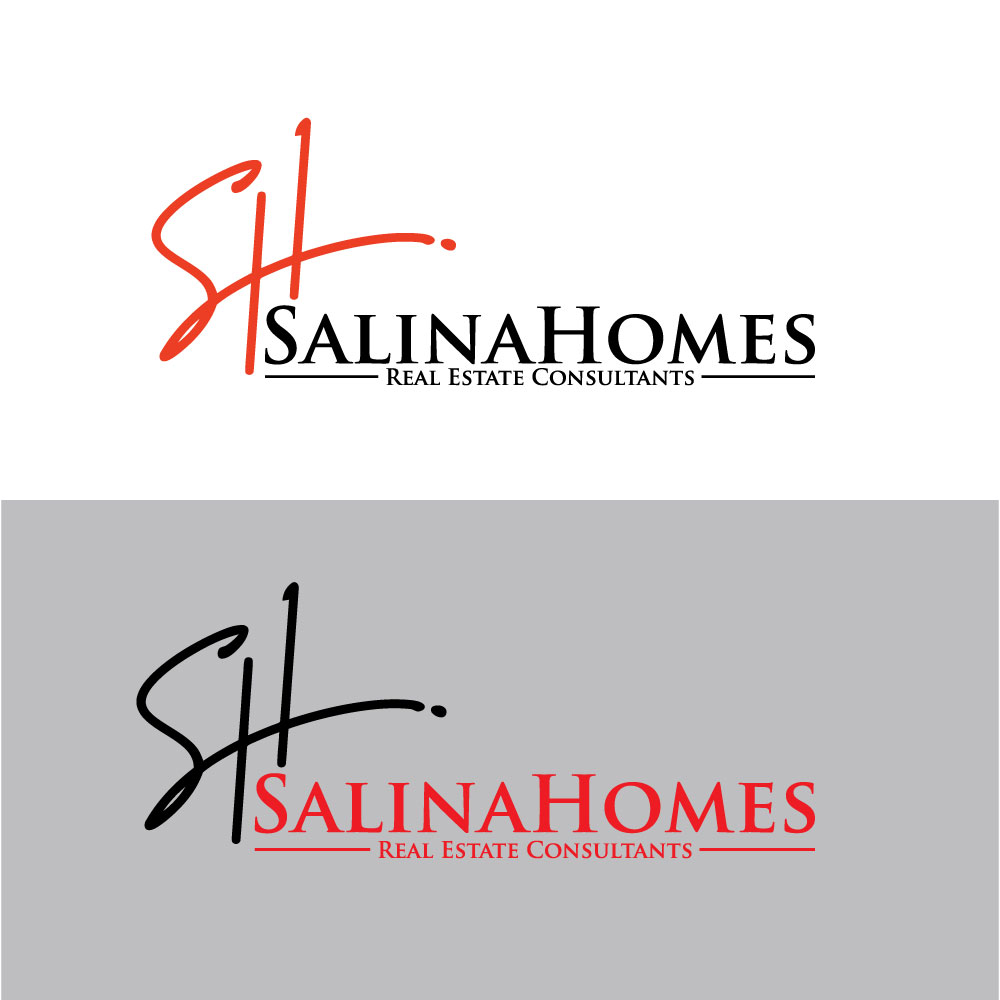
Real Estate Company Logo SalinaHomes
Want to win a job like this?
This customer received 724 logo designs from 233 designers. They chose this logo design from Sumon320 as the winning design.
Join for free Find Design Jobs- Guaranteed
-
 US$300
-
 724 designs
-
 233 designers
Logo Design Brief
We are a realestate company. We are doing a rebrand of logo.. when we opened are name was SalinaHomes.com . We would like to drop the .com and just go with SalinaHomes. We think that a Roof over the logo has been over used.. our current colors are Red Black and white… maybe looking at black and silver moving forward maybe the red shown as well with second option.
You can go to our web-site to see our current logo. Thanks in advance.
Updates
OK we may want to stay with our same font and sizing and spacing that we originally have been taking off the.com. I guess what we’re really looking for is then something re-designed around that particular font whether it’s lines put in a box letters on the top something that makes the logo look different, but with the same font of our other logo.
Added Saturday, 28 October 2023
Trying to post our current logo but not able to.. so you can go to our website SalinaHomes.com to look at it. We are also relocating to a building which the inside is very industrial. Not sure if that helps in the design.
Added Saturday, 28 October 2023
Logo Text
SalinaHomes
Logo styles of interest
Emblem Logo
Logo enclosed in a shape
Abstract Logo
Conceptual / symbolic (optional text)
Font styles to use
Colors
Colors selected by the customer to be used in the logo design:
Look and feel
Each slider illustrates characteristics of the customer's brand and the style your logo design should communicate.
Elegant
Bold
Playful
Serious
Traditional
Modern
Personable
Professional
Feminine
Masculine
Colorful
Conservative
Economical
Upmarket
Requirements
Should not have
- Not looking for a roof top