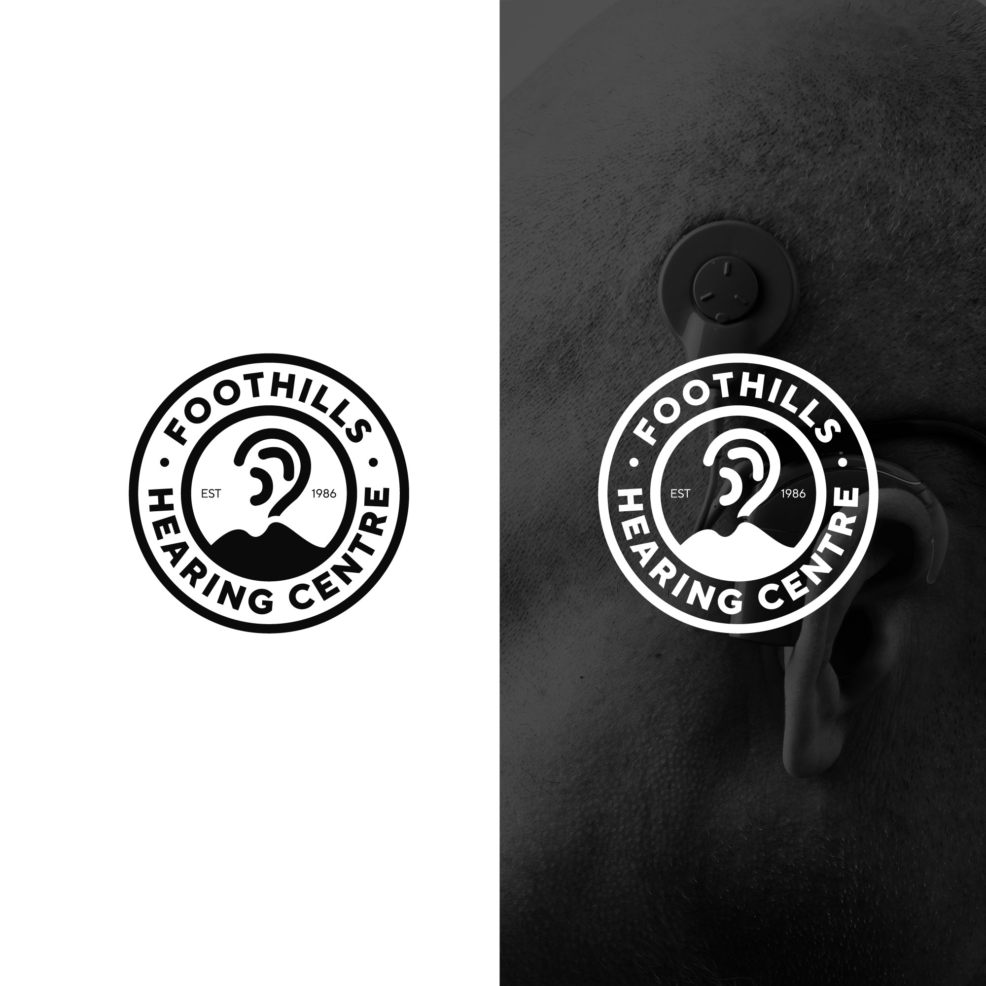
Foothills Hearing Centre - Hearing Clinic Logo

Want to win a job like this?
This customer received 57 logo designs from 34 designers. They chose this logo design from tboydesigns as the winning design.
Join for free Find Design JobsLogo Design Brief
We are a hearing clinic located in a farming community in southern Alberta established in 1986 We do hearing test hearing aids ear protection.
I have attached our old logo however we have had some negative feedback ... "Hearing Centre" is not visible enough all people see is "Foothills" Also the font is "holy" and make it impossible to emborder our logo. Also there is no reference to ears/hearings or our industry.
I am looking for a cleaner simpler modern clear style.
No bright colors as well.
Industry/Entity Type
Health
Logo Text
Foothills Hearing Centre
Font styles to use
Colors
Designer to choose only greyscale colors for use in the design.
Look and feel
Each slider illustrates characteristics of the customer's brand and the style your logo design should communicate.
Elegant
Bold
Playful
Serious
Traditional
Modern
Personable
Professional
Feminine
Masculine
Colorful
Conservative
Economical
Upmarket
Requirements
Must have
- Foothills Hearing Centre