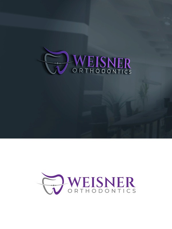
Weisner Orthodontics Logo for letterhead, merch

Want to win a job like this?
This customer received 159 logo designs from 53 designers. They chose this logo design from sanober11 as the winning design.
Join for free Find Design JobsLogo Design Brief
Modern, clean logo appropriate for letterhead, T-shirts, stickers, website for a family-friendly orthodontic practice. Appealing to teens and adults. Professional but accessible. Colors to be purple, black, silver, white.
Updates
Slow in providing feedback
Target Market(s)
Suburban moms in their 30's and 40's
Industry/Entity Type
Healthcare/Dentistry/Orthodontics
Logo Text
Weisner Orthodontics
Logo styles of interest
Wordmark Logo
Word or name based logo (text only)
Lettermark Logo
Acronym or letter based logo (text only)
Font styles to use
Colors
Colors selected by the customer to be used in the logo design:
Look and feel
Each slider illustrates characteristics of the customer's brand and the style your logo design should communicate.
Elegant
Bold
Playful
Serious
Traditional
Modern
Personable
Professional
Feminine
Masculine
Colorful
Conservative
Economical
Upmarket
Requirements
Must have
- "Weisner" should be larger/more dominant than Orthodontics. Colors to be purple, black, silver (white as needed)
Nice to have
- Components to include: brace(s), and possibly a tooth. Make it possible to isolate WO component for branding purposes.