PanoScape - Software Company Logo Rebrand
Want to win a job like this?
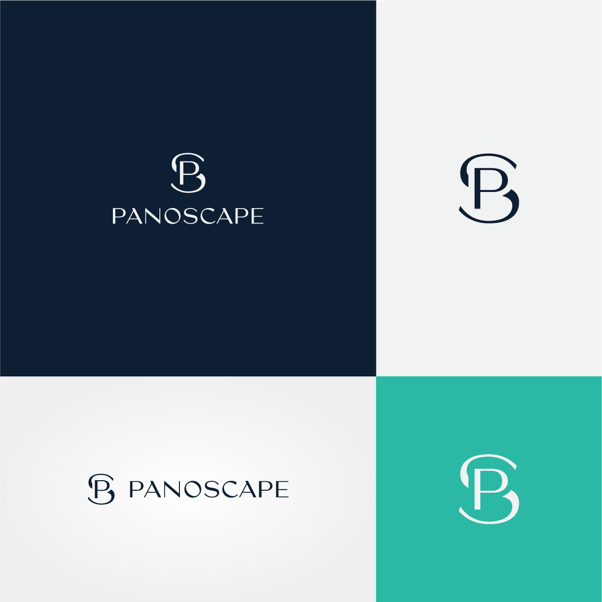
This customer received 133 logo designs from 79 designers. They chose this logo design from Dynopoint as the winning design.
Join for free Find Design Jobs- Guaranteed
-
 US$150
-
 133 designs
-
 79 designers
Logo Design Brief
We are looking to rebrand our company logo, at present it is just text based. Our new logo would be great to include an Icon of some sorts along with the company name. Colors we want to move away from orange and look at a color palette using potentially dark blue as the main color but open to other color ways. We have played around with the idea of using the leaf from the state tree of Illinois as the icon. We also like the idea of an intertwined figure of eights as the icon, or using the P & S as an icon but created in an elegant way. The new logo wants to be elegant and minimalist. Please check out our website www.panoscape.com to see what we do, but at heart we are a software development company.
Industry/Entity Type
Software Development
Logo Text
PanoScape
Logo styles of interest
Pictorial/Combination Logo
A real-world object (optional text)
Abstract Logo
Conceptual / symbolic (optional text)
Lettermark Logo
Acronym or letter based logo (text only)
Font styles to use
Look and feel
Each slider illustrates characteristics of the customer's brand and the style your logo design should communicate.
Elegant
Bold
Playful
Serious
Traditional
Modern
Personable
Professional
Feminine
Masculine
Colorful
Conservative
Economical
Upmarket
Requirements
Must have
- Icon & Text