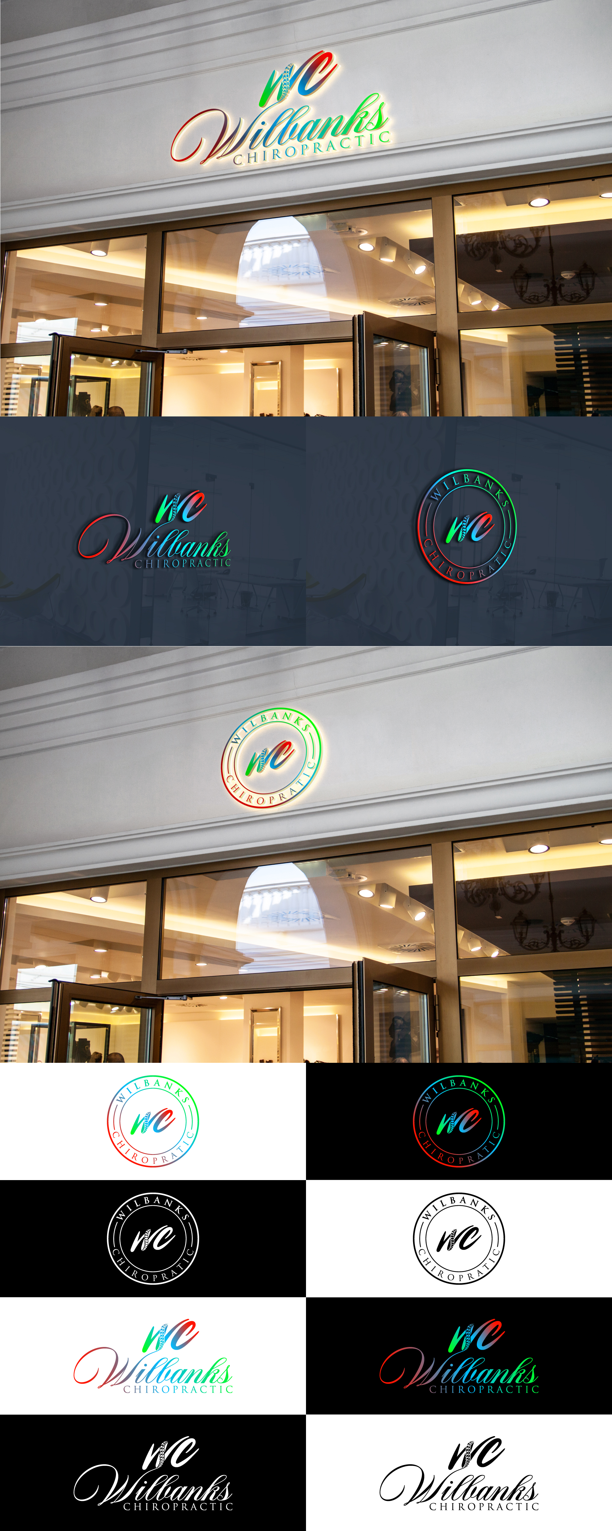
Wilbanks Chiropractic logo for signs and merchandise
Winner
Want to win a job like this?
This customer received 135 logo designs from 53 designers. They chose this logo design from mdkhayrulbashar18 as the winning design.
Join for free Find Design Jobs-
 US$199
-
 135 designs
-
 53 designers
Logo Design Brief
The circle logos are a direction we are thinking of going. The red,blue,green logo is our old one. We would like something simple yet bold. Ability to go black and white is good, but red blue green could ad some pop maybe in the ring of a circle logo or something. Want something fresh for custom shirts made on vinyl heat transfer, for embroidered golf polo, and for hats. Multiple designs are ideal for male/female doctors and patients.
Target Market(s)
People familiar with our office but not our brand/logo.
Industry/Entity Type
Chiropractic
Logo Text
WC Wilbanks Chiropractic
Font styles to use
Serif
Script
Look and feel
Each slider illustrates characteristics of the customer's brand and the style your logo design should communicate.
Elegant
Bold
Playful
Serious
Traditional
Modern
Personable
Professional
Feminine
Masculine
Colorful
Conservative
Economical
Upmarket
Requirements
Must have
- Multiple logos. Clean, uncomplicated. Masculine and feminine designs for male and female doctors and patients.
Nice to have
- Red blue green colors subtly incorporated. “WC” as an abbreviation.
Files
Download all files - 0.2 MBPNG
Wilb Chiro logo - Edited
Wednesday, October 26, 2022
PNG
Favorite Logo #2
Wednesday, October 26, 2022
PNG
Favorite LOGO-2
Wednesday, October 26, 2022
Payments
1st place
US$150
Participation payments x 1
US$49