Redesign logo of local small market Agricultural Coop that is over 100 years old
Want to win a job like this?
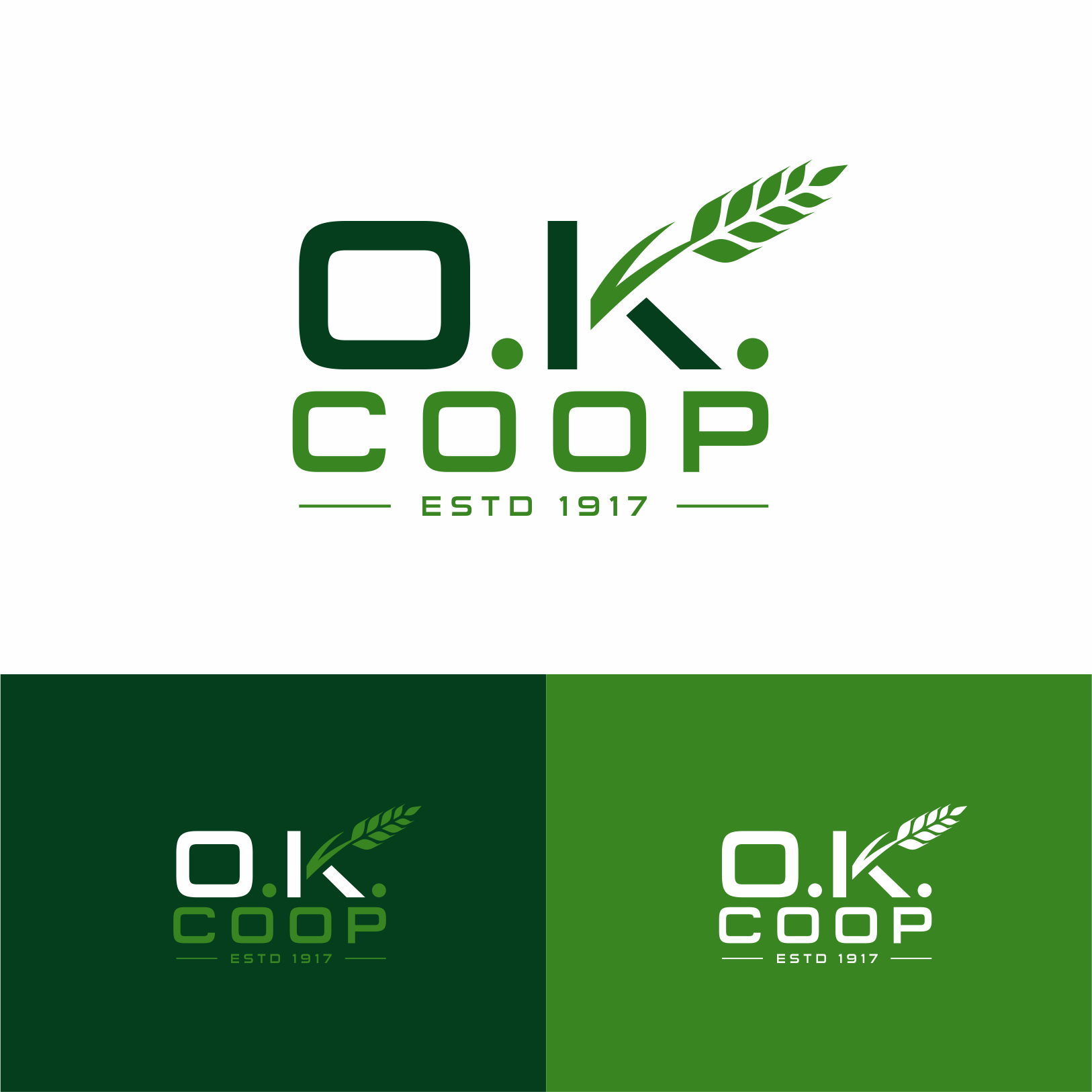
This customer received 96 logo designs from 40 designers. They chose this logo design from Sibyle as the winning design.
Join for free Find Design Jobs- Guaranteed
-
 US$150
-
 96 designs
-
 40 designers
Logo Design Brief
Full name of our company is O.K. Cooperative Grain and Mercantile Company, founded in 1917. O.K. means Oklahoma Kansas as we set near the border of two states. We are looking for letter head website logo that speaks to our history and our small local market or flavor... Our company is a small full service Agricultural firm that buys grain, sells crop inputs (Fertilizer - pesticide), seed, fuel, and manufactures livestock feed. We are owned by local farmers - ranchers.
We serve s small local cliental and just want to reinforce our history, and relevance to the area, our stockholders and patrons.
Farm Simply - Feed simply are some of the themes I have running in my head ... we source most inputs for our feed locally and use simple ingredients
I attached an old logo.. the current one can be found @ okcoop.com
Thinking that we want to continue to use wheat heads (grain) as a part of the logo but something cleaner than the old logo and less cartoonish than the newer.. would like to get away from the red and blue or at least not so stark or crayola ish
Target Market(s)
Ag producers, mostly wheat farmer and cattle
Industry/Entity Type
Agriculture
Logo Text
O. K.
Logo styles of interest
Emblem Logo
Logo enclosed in a shape
Pictorial/Combination Logo
A real-world object (optional text)
Lettermark Logo
Acronym or letter based logo (text only)
Look and feel
Each slider illustrates characteristics of the customer's brand and the style your logo design should communicate.
Elegant
Bold
Playful
Serious
Traditional
Modern
Personable
Professional
Feminine
Masculine
Colorful
Conservative
Economical
Upmarket
Requirements
Must have
- Simple elegance
Nice to have
- Reference to founding year 1917