Infographic representing workforce
Want to win a job like this?
This customer received 12 graphic designs from 6 designers. They chose this graphic design from UD Designs as the winning design.
Join for free Find Design Jobs- Guaranteed
-
 US$100
-
 12 designs
-
 6 designers
Graphic Design Brief
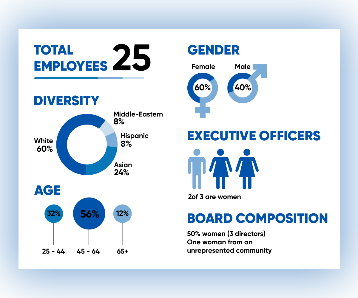
Hello - I would like an infographic created to insert into a document to represent the composition of our workforce.
I've attached one very casual idea below but do NOT like the pink! Would prefer something a little more professional / modern.
Here is the information:
TOTAL EMPLOYEES
25
DIVERSITY
White: 60%
Asian: 24%
Hispanic: 8%
Middle-Eastern: 8%
AGE
25 - 44: 32%
45 - 64: 56%
65+: 12%
GENDER
Female: 60%
Male: 40%
EXECUTIVE OFFICERS
2of 3 are women
BOARD COMPOSITION
50% women (3 directors)
One woman from an unrepresented community
Font styles to use
Colors
Colors selected by the customer to be used in the logo design:
Look and feel
Each slider illustrates characteristics of the customer's brand and the style your logo design should communicate.