Supplement Company Needs a Label Design
Want to win a job like this?
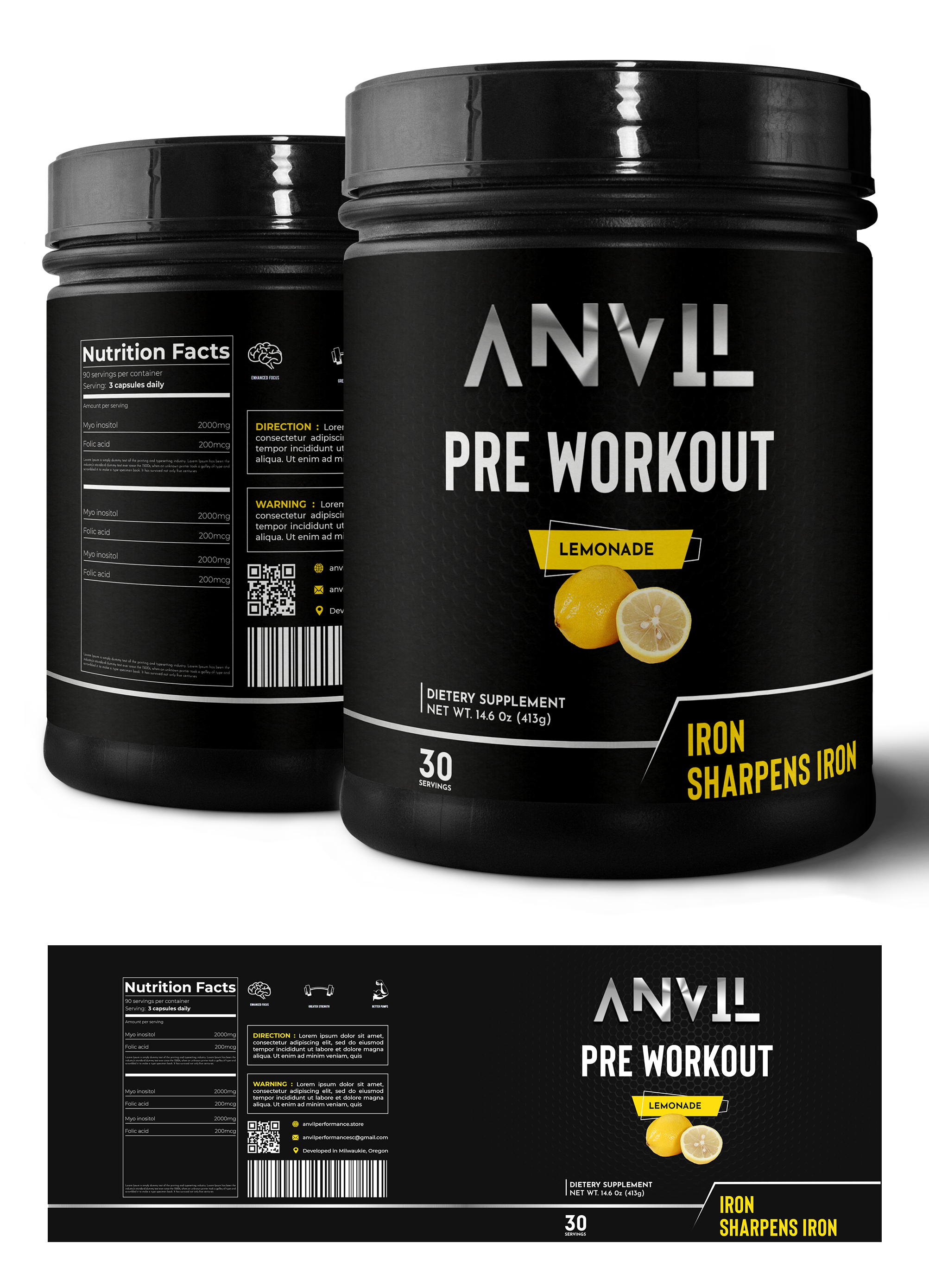
This customer received 23 label designs from 7 designers. They chose this label design from Graphic Storm as the winning design.
Join for free Find Design Jobs-
 US$120
-
 23 designs
-
 7 designers
Label Design Brief
We need a label design for our pre-workout tub. Our company name is Anvil Performance, we would like to emphasize the product's clinically dosed, science-based, transparent formula. We would like the label to mention our slogan "Iron Sharpens Iron." We would like you to experiment with colors and color schemes; the photo included is colorful, but that's not necessarily what we are looking for. We would like our main font & color scheme to match our theme of grittiness and boldness. We would like you to include how it boosts energy, enhances focus, creates bigger pumps, and elongates endurance. (Preferably on the back written vertically aside the supplement facts.) Photo 1 (Ghost) is the guideline for the overall idea of what the pre-workout should look like, excluding color scheme and font. Photo 2(Outwork Nutrition) is how we'd like to present the energy, focus, pumps, & endurance. This label shows the ingredients next to the supplement facts, however we'd like to show the boosted energy, enhanced focus, bigger pumps, and elongated endurance. The final design should communicate boldness, grit, but we would like it to remain uncluttered and clean looking.
Target Market(s)
Our target market is primarily males who workout in the gym.
Font styles to use
Other font styles liked:
- Blanka
Look and feel
Each slider illustrates characteristics of the customer's brand and the style your logo design should communicate.
Elegant
Bold
Playful
Serious
Traditional
Modern
Personable
Professional
Feminine
Masculine
Colorful
Conservative
Economical
Upmarket
Requirements
Nice to have
- Can incorporate the logo attached if you would like.