Lighthouse Storage is a self-storage operator in need of a two-sided sign design
Want to win a job like this?
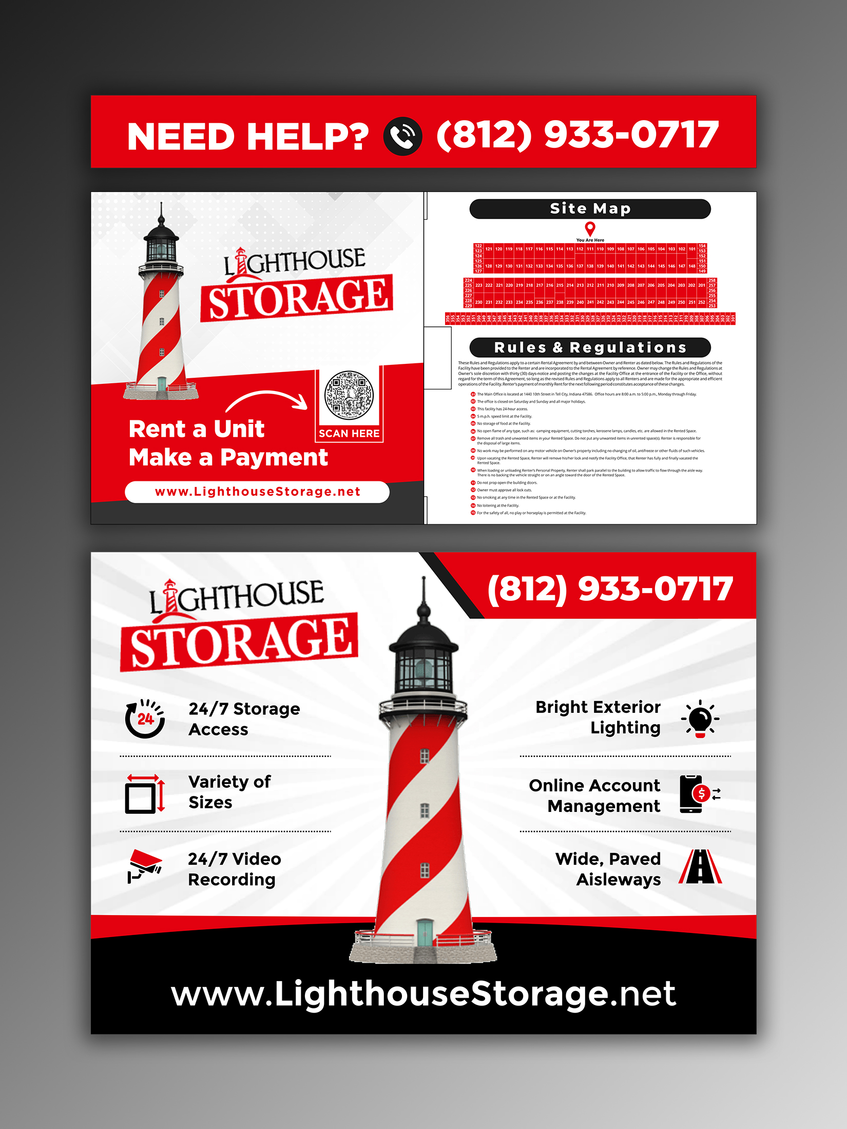
This customer received 42 signage designs from 6 designers. They chose this signage design from ecorokerz as the winning design.
Join for free Find Design Jobs-
 US$110
-
 42 designs
-
 6 designers
Signage Design Brief
4/11/22 - UPDATE: use a telephone icon similar to that now attached to the brief as "Active Phone Icon.jpg"
4/8/22 - UPDATE: The Unit 110 split should align with the units on either side of it - one 10 X 10 and one 10 X 20.
Design both sides of self-storage facility signage to share with current and potential tenants the ease of renting digitally.
Side 1 faces the road and will greet current and potential customers as they enter / drive past the facility. This sign should attract the eye, identify the Lighthouse Storage facility, and offer basic information about the facility including our URL (www.lighthousestorage.net); and our phone number (812-933-0717).
Side 2 faces walk-up customers and those customers driving past the signage along the driveway. This side should appeal to current and future tenants by demonstrating the ease of online rentals, payments and communication. This sign has three separate "sections" that will be pieced together as demonstrated in the attached layout:
Section 1 - 48" X 48" - should include: "Rent a Unit"; "Make a Payment"; and our logo
Section 2 - see attached additional size information - should include: our QR Code; "Scan Here"; Rules & Regulations; and our Site Map
Section 3 - "Need help - call (812)933-0717"
Two site map versions have been provided. The Batesville Site Map is what the final should look like. (The Kiosk Map - Detail map is provided only for the purpose of reading the unit numbers. NOTE: The Batesville Site Map demonstrates the division of units 333 (into units 333 and 334); 110 (into units 110 and 139); and 115 (into units 115 and 134).
We will remove a portion of the fencing in front of the facility to install the two-sided signage. Our color-scheme is red with black and white accents. The imagery in the attached facility image is dated. All of the overhead doors are now red.
Look and feel
Each slider illustrates characteristics of the customer's brand and the style your logo design should communicate.