Video Game Logo Design: That's Not How It Happened (WORDMARK LOGO)
Want to win a job like this?
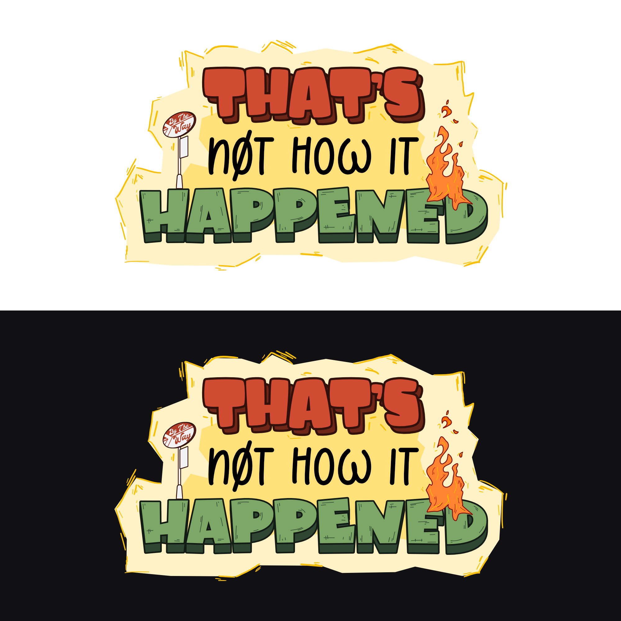
This customer received 75 logo designs from 24 designers. They chose this logo design from EspadaDesign as the winning design.
Join for free Find Design Jobs-
 US$390
-
 75 designs
-
 24 designers
Logo Design Brief
IMPORTANT NOTICE:
You may refer to SUPER MARIO GAMES / PS4 HALO GAME text logo for the idea, this is text based as we will be using the logo for the game collaterals. Your creativity is needed on coming up with the logo text that encapsulates the game similar to the logo of SUPER MARIO Nintendo games. Avoid using the characters on the logo,
A MUST IS: USE / CREATE YOUR OWN FONT, THIS IS A TEXT BASED LOGO, THE FONT SHOULD BE UNIQUE AS IT IS THE ESSSENSE OF THE LOGO TEXT.
You may add other designs like, referring to SUPER MARIO ODYSSEY LOGO; there is an artwork of the earth and Mario's hat. The characters weren't involved but the design matched the logo text.
BEFORE SUBMITTING PLEASE watch the gameplay trailer link below AND read the brief, look at the info below. Apologies if the deliverables were unclear before - this should rectify that. Ignore the confusing directions that were here previously.
First, a quick clip of the work-in-progress gameplay; detailed briefs below/attached:
https://youtu.be/fSgqnAfL-LE
Updates
Hi All,
If you took a look at this brief previously and were confused/annoyed by it's vagueness or weird processes, please take a look again - have updated it with more detail and less odd steps (our bad!)
Added Friday, March 4, 2022
Target Market(s)
The target audience for That’s Not How It Happened is people who appreciate games, retro games, comedic, narrative-driven games, and casual gamers.
Industry/Entity Type
Video Games
Logo Text
That's Not How It Happened
Colors
Colors selected by the customer to be used in the logo design:
Look and feel
Each slider illustrates characteristics of the customer's brand and the style your logo design should communicate.
Elegant
Bold
Playful
Serious
Traditional
Modern
Personable
Professional
Feminine
Masculine
Colorful
Conservative
Economical
Upmarket
Requirements
Must have
- color pallet that matches the game look - if you look at the video, each of the three main characters has a colored word bubble: Zoey (daughter) is green, George (father) is red and Alan (son) is blue...please use those colors primarily and not the brown bg.
Should not have
- TNHIH or any abbreviation; the brown burned out background in the bg of the game