SHOW ME COOL TRIANGLES!
Want to win a job like this?
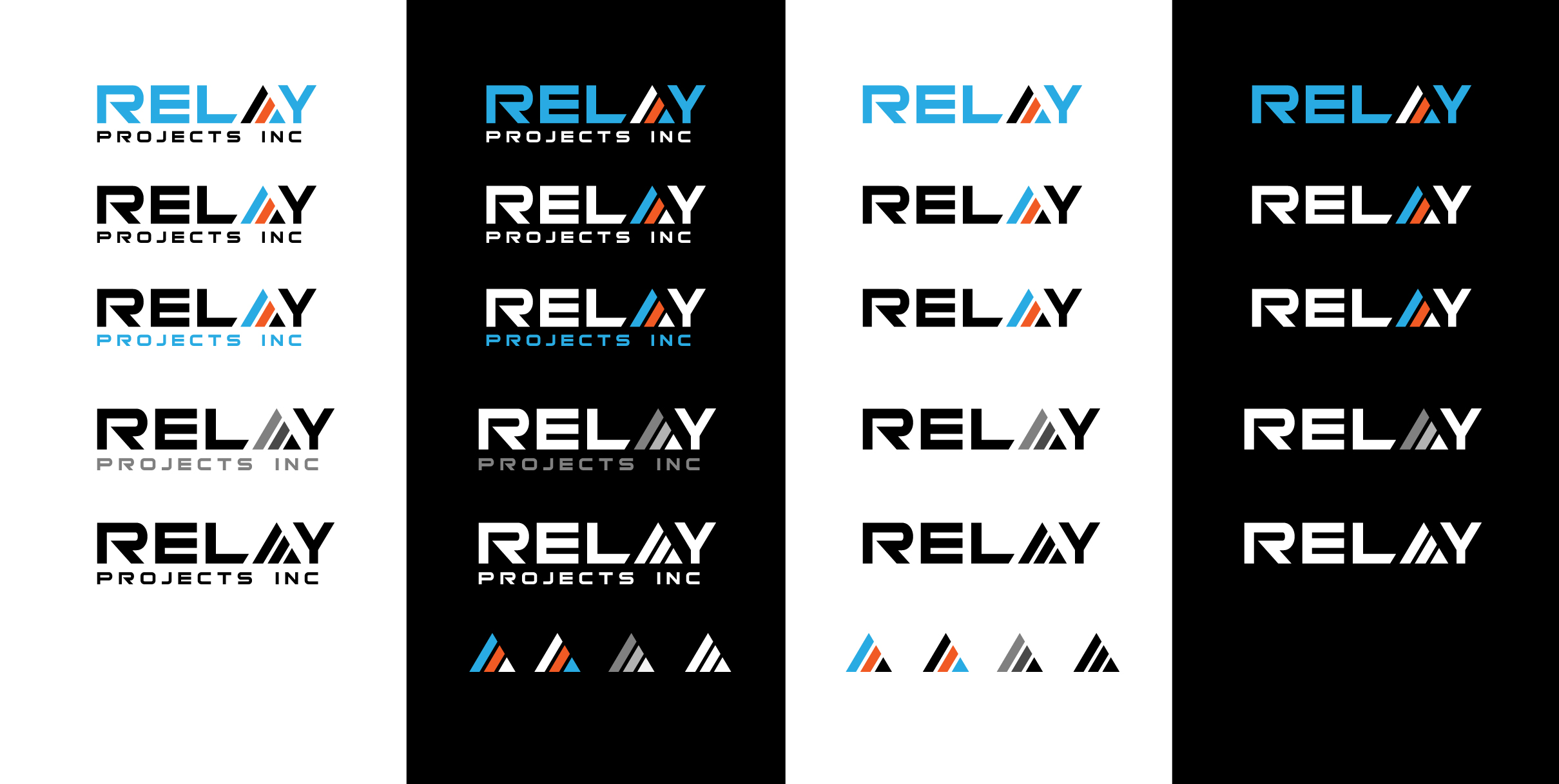
This customer received 223 logo designs from 65 designers. They chose this logo design from sol design2 as the winning design.
Join for free Find Design Jobs- Guaranteed
-
 C$200
C$200
-
 223 designs
-
 65 designers
Logo Design Brief
THE COMPANY
Relay Projects Inc is a new construction management firm in BC, Canada. We use emerging methodologies and a fresh perspective to deliver results.
THE LOGO
- needs to represent a relay race in some way
- should be crisp, clean, sharp, efficient
- can be a wordmark, or abstract/conceptual style
BACK STORY
Construction that is well managed should be something like a relay race, because it should run multiple concurrent “lanes” of tasks and activities, with each trade handing off smoothly to the next trade, to get to the finish line.
Target Market(s)
Land owners and developers who need a professional construction company to build subdivisions and communities with mid-market, quality homes... also homebuyers looking for a well built home built efficiently
Industry/Entity Type
Construction
Logo Text
RELAY PROJECTS INC
Logo styles of interest
Pictorial/Combination Logo
A real-world object (optional text)
Abstract Logo
Conceptual / symbolic (optional text)
Wordmark Logo
Word or name based logo (text only)
Font styles to use
Other font styles liked:
- Bitsumishi, Xolonium, or choose your own?
Colors
Colors selected by the customer to be used in the logo design:
Look and feel
Each slider illustrates characteristics of the customer's brand and the style your logo design should communicate.
Elegant
Bold
Playful
Serious
Traditional
Modern
Personable
Professional
Feminine
Masculine
Colorful
Conservative
Economical
Upmarket
Requirements
Must have
- A graphic element (abstract or wordmark style) that represents a relay race (ie: 3 or more “lanes”), or the handing of the baton from one runner to the next • Must work on a BLACK, WHITE, or MEDIUM GREY background (some colours can be reversed to make it work) • All text in all caps • IMPORTANT: Font for the R in “RELAY” must be the R from the font “BITSUMISHI” but … I don’t like the shape of the A or Y in this font. I’d prefer to either find or design alternate letters of EQUAL SIZE AND WEIGHT so they appear to all be in the same font. • I like E’s with the vertical line, and I like A’s and Y’s that are sharp and angular, not square/rounded as they are in Bitsumishi • Colour codes - Blue: RGB 41-171-226 Orange: RGB241-90-36
Should not have
- • No acronyms - no "RP" or "RPI" logos. • No stick figure running people or obvious "construction" related graphics - no houses, roof lines, hammers, nails, etc. • No Serif fonts • No outlines around the logo • The three parallel lines in the letter E cannot represent the 3 lanes of the relay runners, but this concept COULD be used in the letter A (ie: turning the “lanes” on an angle, or moving straight upwards at varying lengths)