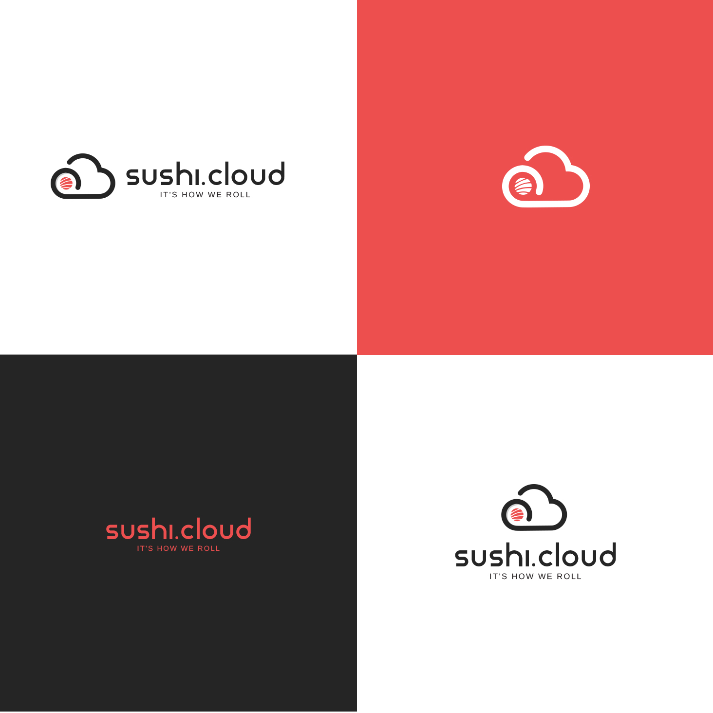
Logo for Cloud Compute company, Sushi.cloud
Want to win a job like this?
This customer received 42 logo designs from 23 designers. They chose this logo design from Jpnueva as the winning design.
Join for free Find Design Jobs-
 A$150
A$150
-
 42 designs
-
 23 designers
Logo Design Brief
Logo design for our cloud compute company, sushi.cloud. The logo can be all caps, all lower case, or a combination, we're interested to see variations. Our slogan is: It's how we roll and we would like to see that incorporated into the logo.
Our cloud computing solutions are dedicated (as opposed to the majority of the industry which are shared), secure, faster, cheaper and better. This is all important to the brand.
The brand identity will be present primarily online, plus corporate material.
Target Market(s)
High-tier corporate, university and IT organisations seeking powerful, dedicated, secure, better cloud compute solutions.
Industry/Entity Type
IT
Logo Text
sushi.cloud (can be all lowercase, all uppercase, or combination. Slogan: It's how we roll
Logo styles of interest
Pictorial/Combination Logo
A real-world object (optional text)
Font styles to use
Colors
Colors selected by the customer to be used in the logo design:
Look and feel
Each slider illustrates characteristics of the customer's brand and the style your logo design should communicate.
Elegant
Bold
Playful
Serious
Traditional
Modern
Personable
Professional
Feminine
Masculine
Colorful
Conservative
Economical
Upmarket
Requirements
Nice to have
- I have uploaded a sample stock logo file and we like the black (or dark green Nori colour), white (rice) and red/pink (raw salmon/tuna) color scheme. I am thinking the font could have a *very* mild Asian influence (given the name Sushi) but nothing like Brush script font, asian characters, etc. This very mild Asian influence is not a requirement though, just a vague notion.