Breadwinners crowdsourcing project for a new logo
Want to win a job like this?
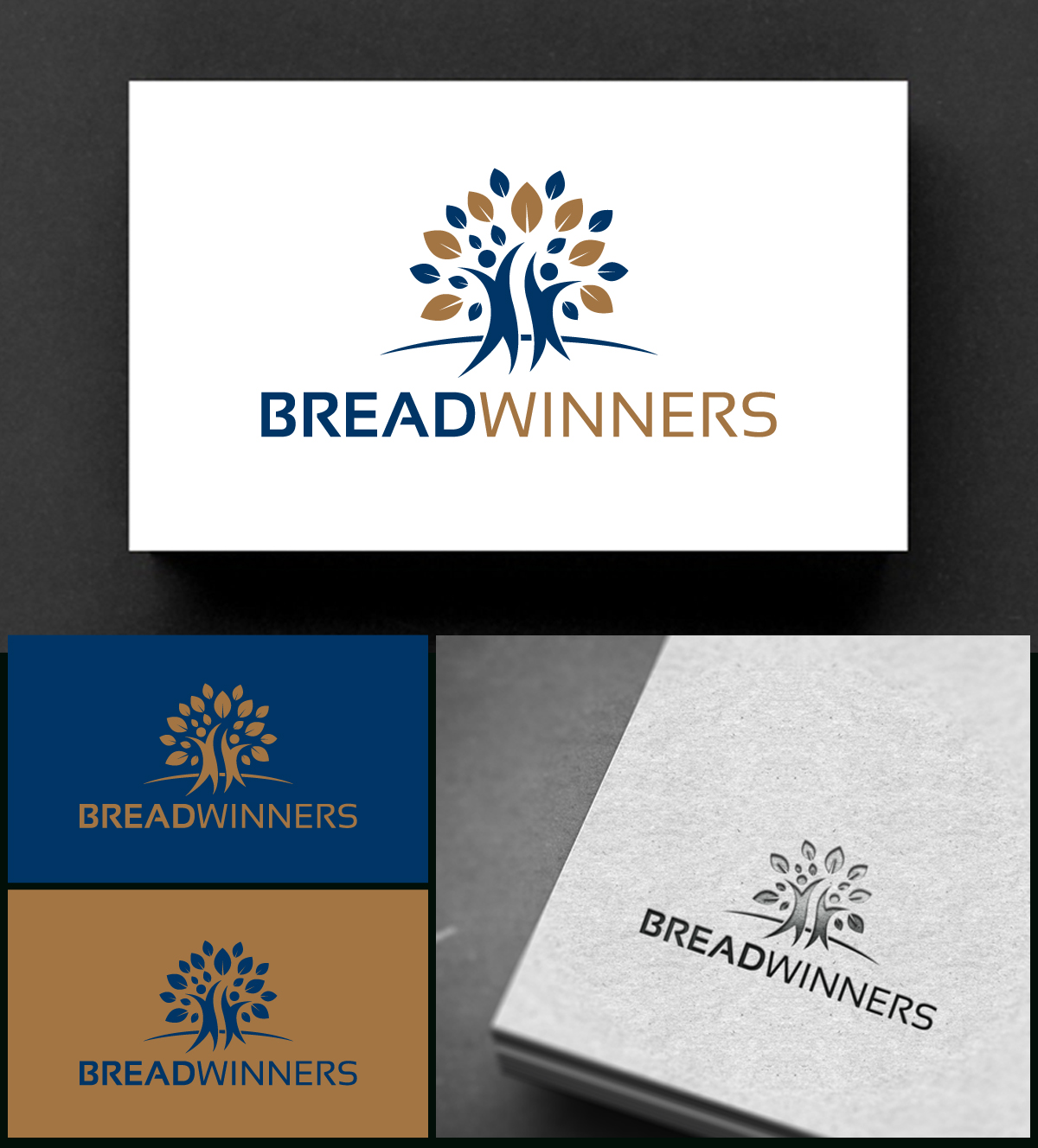
This customer received 161 logo designs from 78 designers. They chose this logo design from Rueell Artss as the winning design.
Join for free Find Design Jobs- Guaranteed
-
 €110
€110
-
 161 designs
-
 78 designers
Logo Design Brief
Breadwinners is a coaching company that teaches people how to earn money on the real estate market. Bread stands for food, feeding, abundance. winners stands for successful entrepreneurship.
Updates
Need extra days to review
Target Market(s)
iGlobal market. Individuals not businesses so I want it to feel accessible and positive while communicating winning and success. It shouldn’t be formal (i.e. script or serif) nor should it be overly professional (i.e. stodgy). Young to middle-aged men and women who feel locked out of their dreams economically by choice (stay at home parents) or macro-factors (Covid economy). Our first target segment includes stay at home parents. Our next target markets include veterans and teachers.
Industry/Entity Type
Real Estate Investment / Side-Hustle / side job
Logo Text
Breadwinners
Logo styles of interest
Emblem Logo
Logo enclosed in a shape
Pictorial/Combination Logo
A real-world object (optional text)
Abstract Logo
Conceptual / symbolic (optional text)
Character Logo
Logo with illustration or character
Font styles to use
Colors
Designer to choose colors to be used in the design.
Look and feel
Each slider illustrates characteristics of the customer's brand and the style your logo design should communicate.
Elegant
Bold
Playful
Serious
Traditional
Modern
Personable
Professional
Feminine
Masculine
Colorful
Conservative
Economical
Upmarket
Requirements
Must have
- Color palette: Gold #A37543 #003566 #8C0341
Nice to have
- Hands, wheat, partnership, success, abundance, value, dynamic, vitality
Should not have
- Something so abstract as to be meaningless. A shield