Oakes Electronics Logo
Winner
Want to win a job like this?
This customer received 146 logo designs from 79 designers. They chose this logo design from Design Focus as the winning design.
Join for free Find Design Jobs- Guaranteed
-
 A$120
A$120
-
 146 designs
-
 79 designers
Logo Design Brief
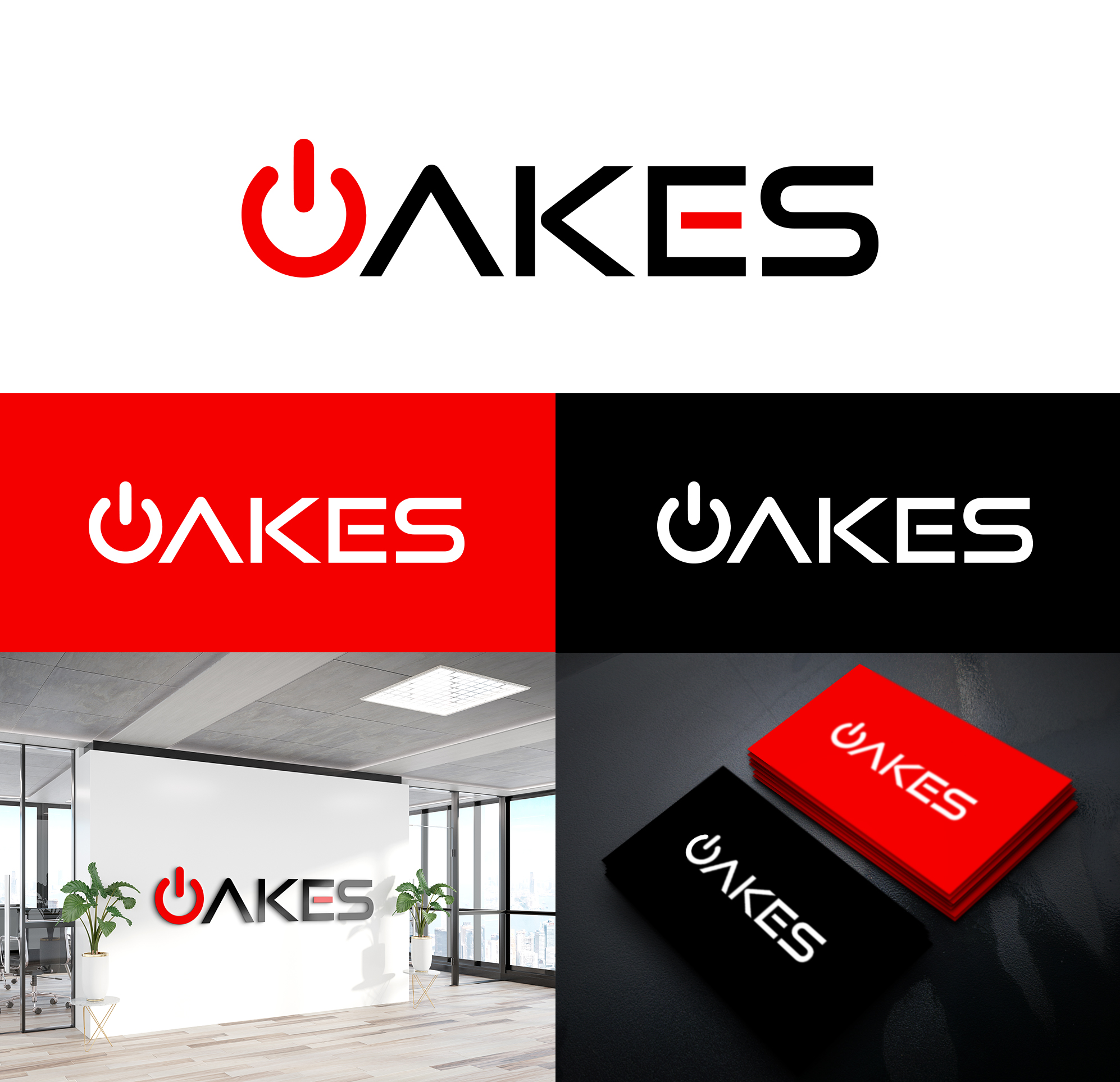
The logo is for an electronics company. The logo is the word “OAKES” in upper case, color black. The first letter “O” is to appear like a power-on icon in the color green or blue or red. For example, the black “O” could be broken/open at the top with a centered vertical line in green, blue or red so the “O” looks like a power button. The logo is to look modern, crisp, clean & simple.
Target Market(s)
Upmarket
Industry/Entity Type
Electronics
Logo Text
OAKES
Logo styles of interest
Wordmark Logo
Word or name based logo (text only)
Font styles to use
Sans Serif
Colors
Designer to choose only greyscale colors for use in the design.
Look and feel
Each slider illustrates characteristics of the customer's brand and the style your logo design should communicate.
Elegant
Bold
Playful
Serious
Traditional
Modern
Personable
Professional
Feminine
Masculine
Colorful
Conservative
Economical
Upmarket
Requirements
Must have
- Power-on symbol
Nice to have
- I’ve been thinking about a border with rounded ends but I think this will detract more than enhance the logo.
Should not have
- Underlines
Payments
1st place
A$120