Food Label Packaging Design Remake Redesign
Want to win a job like this?
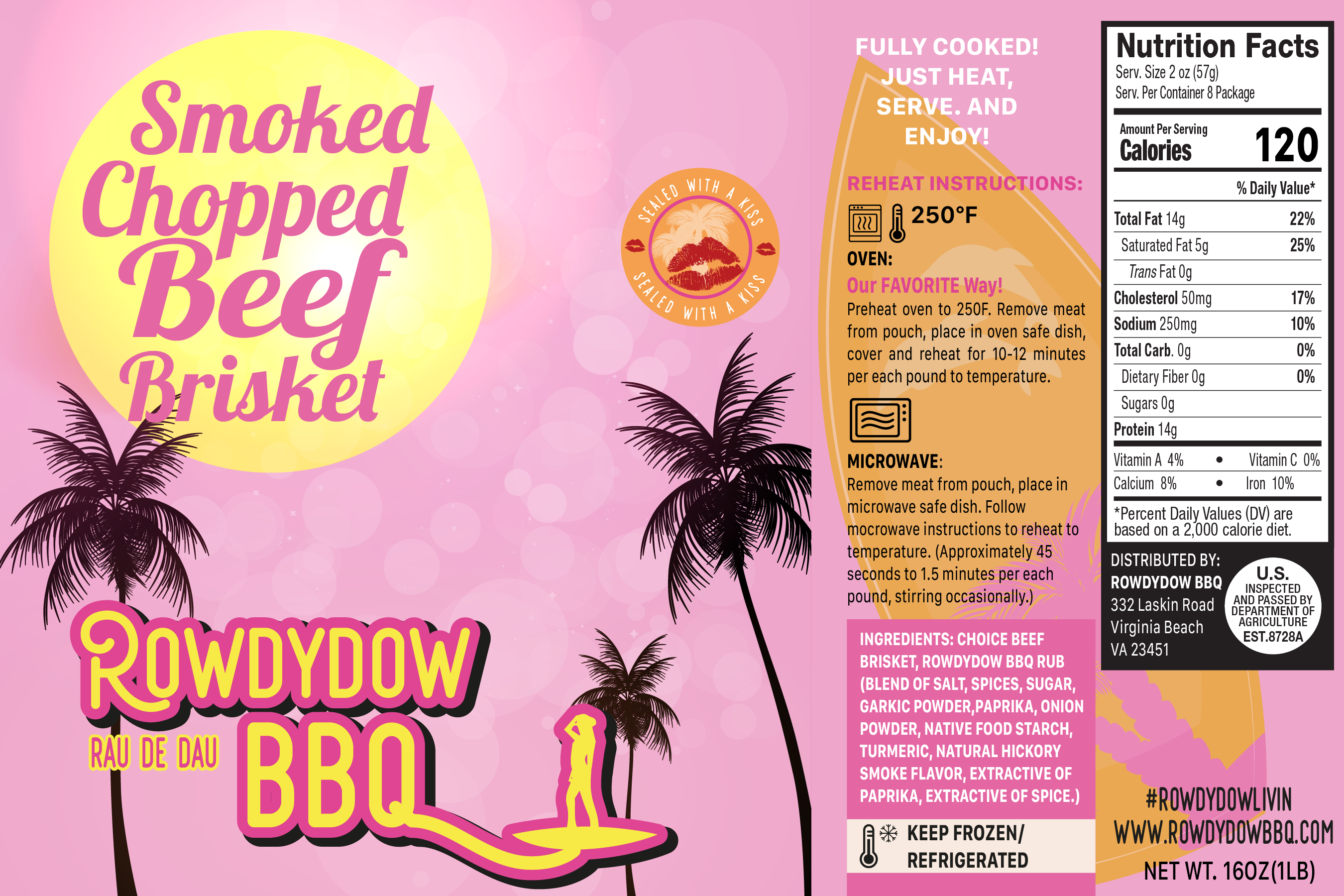
This customer received 24 graphic designs from 5 designers. They chose this graphic design from Yaris Windzor as the winning design.
Join for free Find Design Jobs- Guaranteed
-
 US$300
-
 24 designs
-
 5 designers
Graphic Design Brief
We are ready for a redo! We want to remake our food label to be more fun, beachy and modern to better reflect our brand's desired vibe and the actual meaning of ‘rowdydow’ as a boisterous party, noisy excitement.
Please first reference the current label and logo elements attached. You can also reference our website www.rowdydowbbQ.com. We want to give our current look the refreshed look described above.
The remaining images represent a design board of interest and inspiration for new color combinations, font style, background, cowgirl meets beach and surf!
REQUIRED elements are
1) The full company name: ROWDYDOW BBQ spelled like this and all caps.
2) The cowgirl - she can be modified to include the surfboard somehow to make her a beachy cowgirl/maybe surfer girl - but she cannot be in a bikini she needs to still have pants/boots on...as in a 'mash up' of cowgirl and beach/surfer girl that represents the noisy excitement of a 'rowdydow' . Please do NOT cut her in half
3) The ‘Sealed with a Kiss’ seal to have that matches to have a beachy, playful feel to it, maybe palm tree/kiss lips combo ?
4) Much of the right side of the label must be included but can be presented in a totally different way: the preparation directions, the nutritional panel nd bottom right product information. all can be rearranged - its most important that the preparation instructions are legible.
5) Product title
The remaining images represent a design board of interest and inspiration for new color combinations, font style, background, cowgirl meets beach and surf!
**Please DO NOT make country-western**
Updates
Added Thursday, July 22, 2021
Target Market(s)
Moms, Dads and Singles who are 'foodies' with a busy family and social, work schedule who value authentic, great tasting food that is authentic, boutique and better than for you, convenient, and fun to feed and entertain their friends and families.
Industry/Entity Type
food - CPG Consumer Packaged Foods
Font styles to use
Other font styles liked:
- Cursive, playful andf fun! PLEASE SEE FONT IDEAS IN IMAGES ATTACHED
Colors
Colors selected by the customer to be used in the logo design:
Look and feel
Each slider illustrates characteristics of the customer's brand and the style your logo design should communicate.
Elegant
Bold
Playful
Serious
Traditional
Modern
Personable
Professional
Feminine
Masculine
Colorful
Conservative
Economical
Upmarket
Requirements
Must have
- Please see above. Colors: I would like to maintain pink as the main color, along with a cool new beachy black/gray. The other colors below are of interest and are also represented in image ideas provided. Logo - take out 'Virginia's BBQ' and include the phonetic description of rowdydow near/a part of logo rowdydow: /rau de dau/ Ingredients and Nutrtional panel - content doesn't have to be exact but must be represented to scale, but may be decreased in size, especially the nutrition panel. Please be sure the preparation instructions are legible, not too small.
Nice to have
- PLEASE SEE THE NEW INFO GRAPHIC with the 'sun' to consider and also the fun, cursive font to consider in your design. thank you!
Should not have
- Please see above!