Art of Kava Logo
Want to win a job like this?
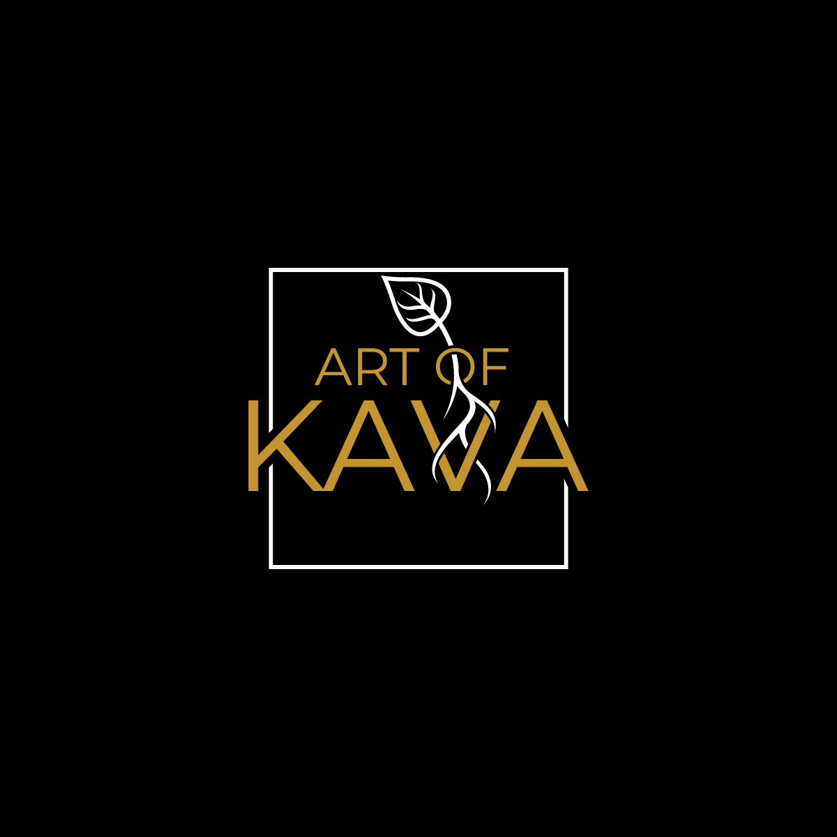
This customer received 114 logo designs from 39 designers. They chose this logo design from Graphic Bricks as the winning design.
Join for free Find Design Jobs-
 US$300
-
 114 designs
-
 39 designers
Logo Design Brief
We need a logo design for our company based in Jacksonville Florida called Art of Kava. We import and sell powdered kava from the south pacific. It's a root that helps reduce stress, anxiety, relaxes muscles, encourages sleep and can be used as a social beverage. It is mainly used as a social beverage in the south pacific islands. It's used for all of the above here in the United States.
The kava plant leaves look pretty specific. look them up to get a good idea. The roots are what are pounded, massaged in water, strained and consumed.
I have an idea of how a winning logo can look. Please see the attached screenshots. I like both designs. I LOVE how the roots are going through the words like electricity, but i dont like the little leaf on top. I LOVE how the tree goes through the O in roots. If the logo can be a combination of the two, with a kava plant going through the O, looking wild and sprawling like the one attached does. That would be fantastic.
It can also use just the kava leaves or just the roots, no need to always use both***
You can also incorporate the image of a Tanoa. Its the bowl used to make kava. the look is pretty specific.
The color scheme has been Black and White (or silver) but if you think of something interesting and simple please submit that! I do like these color schemes below as well.
The logo can be in a circle or square format. As long as it will be easy to add to labeling, stickers, etc.
As the logo says, we're Art of Kava. If we can get an awesome, artistic yet simple-ish design that has that awesome factor no one else in the industry has, you'll be the winner.
Updates
If it has roots using negative space in the letters, it doesnt necessarily have to have leaves. Not interested in falling leaves if they have leaves. I'm also not interested in the premade leaves look. I dont know what else to call it. More interested in the textured/drawn look of the tree in the attachment. The leaves in the other attachment are irrelevant. I'm more looking for that negative space roots going through the letters.
Added Friday, April 30, 2021
Target Market(s)
people that have anxiety, stress, ptsd, insomnia and are looking for a natural alternative to prescription medication.
Industry/Entity Type
Supplement
Logo Text
Art of Kava
Logo styles of interest
Emblem Logo
Logo enclosed in a shape
Pictorial/Combination Logo
A real-world object (optional text)
Abstract Logo
Conceptual / symbolic (optional text)
Character Logo
Logo with illustration or character
Wordmark Logo
Word or name based logo (text only)
Lettermark Logo
Acronym or letter based logo (text only)
Look and feel
Each slider illustrates characteristics of the customer's brand and the style your logo design should communicate.