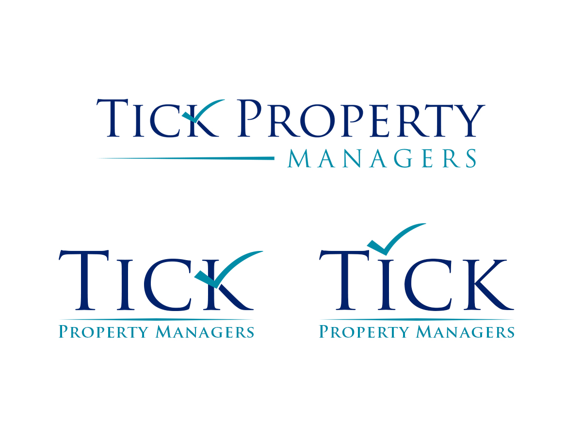
Brand new Property Management business in real estate NSW Australia. Just rentals not sales.

Want to win a job like this?
This customer received 174 logo designs from 74 designers. They chose this logo design from Sajeeda as the winning design.
Join for free Find Design JobsLogo Design Brief
We need a modern, sleek, upbeat, professional, refined, logo. Target audience 35yrs +. Want to stand out from other established real estate businesses. Teal and navy are colours we prefer. We would like to incorporate a "tick" symbol (check mark). We are a new, progressive property management business which we want reflected in the brand.
Target Market(s)
35 years +
Industry/Entity Type
Real Estate
Logo Text
Tick Property Managers
Logo styles of interest
Pictorial/Combination Logo
A real-world object (optional text)
Wordmark Logo
Word or name based logo (text only)
Lettermark Logo
Acronym or letter based logo (text only)
Font styles to use
Colors
Colors selected by the customer to be used in the logo design:
Look and feel
Each slider illustrates characteristics of the customer's brand and the style your logo design should communicate.
Elegant
Bold
Playful
Serious
Traditional
Modern
Personable
Professional
Feminine
Masculine
Colorful
Conservative
Economical
Upmarket
Requirements
Must have
- Tick symbol (check mark) and the words "Tick Property Managers"
Nice to have
- Possibly house related
Should not have
- Must not be busy or chunky.