Continno Logo
Want to win a job like this?
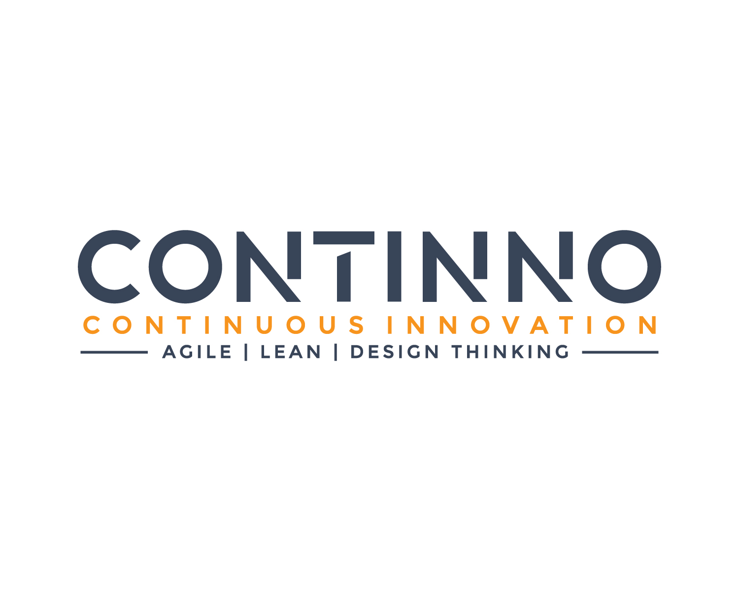
This customer received 115 logo designs from 41 designers. They chose this logo design from Atec as the winning design.
Join for free Find Design Jobs- Guaranteed
-
 €110
€110
-
 115 designs
-
 41 designers
Logo Design Brief
Need a logo for my company Continno. Continno stands for continuous innovation. I am an Agile and Innovation Consultant, trainer and Coach and helping companies to work better by using Agile, Lean, Lean Start-up and Design Thinking principles and frameworks. The bottom line is adapt and improve continuously with agile/ lean and design thinking. I like the logo to be modern and straightforward, like also the link to iterative way of working and constant improvement. I am coaching individuals, team, managers of corporates. Enclosed a ppt with some ideas I already had. Like the colour orange as it stands for results.
Target Market(s)
All Organisations (corporates like ING and Unilever) and small and mid sized companies, all industries
Logo Text
Continno
Logo styles of interest
Emblem Logo
Logo enclosed in a shape
Pictorial/Combination Logo
A real-world object (optional text)
Abstract Logo
Conceptual / symbolic (optional text)
Character Logo
Logo with illustration or character
Wordmark Logo
Word or name based logo (text only)
Lettermark Logo
Acronym or letter based logo (text only)
Font styles to use
Colors
Colors selected by the customer to be used in the logo design:
Look and feel
Each slider illustrates characteristics of the customer's brand and the style your logo design should communicate.
Elegant
Bold
Playful
Serious
Traditional
Modern
Personable
Professional
Feminine
Masculine
Colorful
Conservative
Economical
Upmarket
Requirements
Must have
- Modern, too the point, professional, elegant, stands for high quality ( like apple look and feel), customer satisfaction, results ( orange colour) learning and improvement
Nice to have
- would be great that is has a link with an iterative way of working ( plan, do, check, act) maybe circles, easy to use in email signitures and powerpoint templates (have the idea that square format is easier to use but not sure), maybe also some blue and dark grey elements
Should not have
- Too complicated, not professional