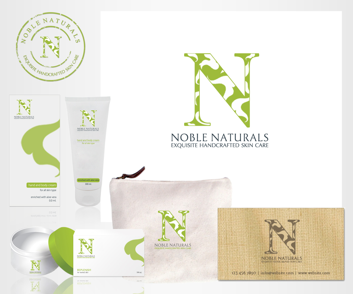
Noble Naturals/ Exquisite Handcrafted Skin Care
Want to win a job like this?
This customer received 72 logo designs from 18 designers. They chose this logo design from m_designs as the winning design.
Join for free Find Design Jobs-
 US$200
-
 72 designs
-
 18 designers
Logo Design Brief
I am launching my fine hand crafted skin care line under a new name (formerly Life in Lavender) which includes my last name. I am interested in having a non gender logo. I have worked with two designers on this project already, and they keep missing it! I am attaching the logo I now have. I think the green/black is too masculine...maybe a charcoal "N" with a smaller serif? The tagline should be in serif but condensed so that it fits better underneath. And the leaves are too crowded and should look less like clip art, or add more leaves and reverse the "N" out?
Those are my thoughts but I am not a designer.
Updates
Project Deadline Extended
Reason: There are a couple of designs I really like. I will send separate messages to you.
Added Saturday, February 01, 2014
Project Deadline Extended
Added Monday, February 03, 2014
Target Market(s)
Age 45-75, Income bracket of $100,000 up
Logo Text
Noble Naturals/Exquisite Handcrafted Skin Care
Logo styles of interest
Pictorial/Combination Logo
A real-world object (optional text)
Abstract Logo
Conceptual / symbolic (optional text)
Look and feel
Each slider illustrates characteristics of the customer's brand and the style your logo design should communicate.
Elegant
Bold
Playful
Serious
Traditional
Modern
Personable
Professional
Feminine
Masculine
Colorful
Conservative
Economical
Upmarket
Requirements
Must have
- I think the green/black is too masculine...maybe a charcoal "N" with a smaller serif? The tagline should be in serif but condensed so that it fits better underneath. And the leaves are too crowded and should look less like clip art, or add more leaves and reverse the "N" out?
Nice to have
- I think the green/black is too masculine...maybe a charcoal "N" with a smaller serif? The tagline should be in serif but condensed so that it fits better underneath. And the leaves are too crowded and should look less like clip art, or add more leaves and reverse the "N" out?
- Those are my thoughts but I am not a designer.