Packaging design Project - for lovers of the distant lands of the Andes and it's organic culture
Want to win a job like this?
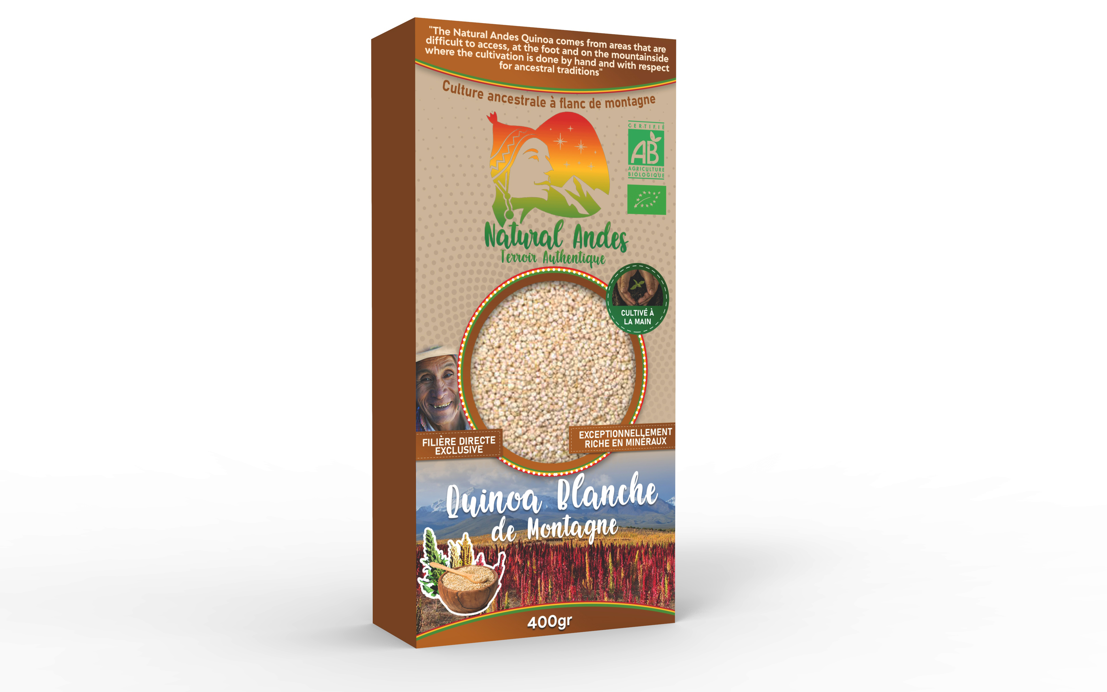
This customer received 21 packaging designs from 5 designers. They chose this packaging design from davidsantacruz7 as the winning design.
Join for free Find Design Jobs- Guaranteed
-
 €90
€90
-
 21 designs
-
 5 designers
Packaging Design Brief
Oyé Oyé, friends of the organic terroir! Lovers of the distant lands and the Andes, this mission is for you!
Our baby, Natural Andes, is preparing for birth! This is your chance to make us dream.
Our values: Giving life to the Authentic Terroir of Bolivia. For it ; provide sustainable solutions for the local terroir of our organic crops.
What is the terroir? (french word). It’s that connection to Human and Earth. Humanity is respect for culture, ancestral know-how, artisanal work. The Earth is the environment, the ecology, this is what the Indians called the Pachamama.
At an altitude of 4200m, La Quinoa de Natural Andes is not cultivated in the plains with combine harvesters. It is cultivated by hand on the feet and on the mountainside. The fallow (66% of the land) allows the soil and the Gods of the Andean cosmovision to come to life.
Our mission is to bring these values to life through these products that we import; White Quinoa , red, Duo (red and white) and Trio (red, black and white).
For this, we are looking for a packaging design. You bring creativity and together we validate the content !
The finished product is intended for end consumers (specialized organic store for example). Its format is 18cm high x 8.5cm long and 4.5cm wide. We therefore need a graphic charter for the entire packaging; or 4 sides totaling 26 cm for 18 cm high. You will mainly work on the visual of the main page (18x8.5), illustration of our committed values through the colors of Bolivia: Red, Yellow and Green. The country being very colorful by nature (google search: "Aguayo cloth") we want to create a breath of life through the liveliness of the colors, that the products are obvious, just like these famous Bolivian Aguayo.
Our Quinoa comes from an authentic terroir. It is harvested by hand and is very rich in nutrition.
We had already worked on packaging, which we want to improve and make more alive. It’s true that the black print kraft background isn’t the best.
Here are some snippets of text taken from this first packaging:
"While the Quinoa of the plains depletes the soils of the Bolivian altiplano ..."
"The Natural Andes Quinoa comes from areas that are difficult to access, at the foot and on the mountainside where the cultivation is done by hand and with respect for ancestral traditions"
Mountain Quinoa committed!
Provides a local solution for the Bolivian terroir.
By respecting the Earth: the Pachamama with the fallow of 66% of the land. A return to the sources, as in the time of the Incas, letting the llamas make the biodiversity of the high plains flourish.
By respect for the Human Being and for future generations. Cultivated and distributed preserving the essence of Andean culture, the rights and croyances of Quechua producers and honoring the values of the Bolivian people.
In summary, I invite you to discover the energy of the project through this video: https://www.youtube.com/watch?v=6MRGEtu-myE
And these few images (attachments)…
And our logo of course on the PDF of our project presentation!
Note: Ideally, the design could include a visual of the raw Quinoa so client could see the product on the packaging. (as enclosed pictures!!!)
And most of all... have fun! Let your creativity EXPLODE! That's exactly what we want you to do. Just plenty be yourself... that's how our client will say 'Whaow!' looking at your art!
enjoy!
Updates
Low designer entries
Target Market(s)
Premium Quinoa consumers. - Engaged consumers for causes and belief throught their product consumption
Font styles to use
Other font styles liked:
- earth quest (for head lines)
Colors
Colors selected by the customer to be used in the logo design:
Look and feel
Each slider illustrates characteristics of the customer's brand and the style your logo design should communicate.
Elegant
Bold
Playful
Serious
Traditional
Modern
Personable
Professional
Feminine
Masculine
Colorful
Conservative
Economical
Upmarket
Requirements
Must have
- Colors (red, green and yellow)
Mountain as backgroud (enclosed)
Quinoa field on the feet or aside the mountain
Autoctones (people)
Quinoa grains (as it is raw)
Nice to have
- Detail of expressing Quinoa is handly cultivated (hand harvest)
Tipical houses in the back
Aguayo motifs (for the graphic charter maybe?)