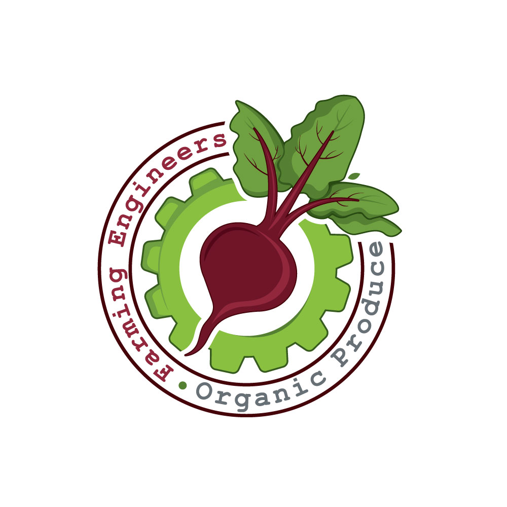
Farming Engineers Organic Produce logo
Winner
Want to win a job like this?
This customer received 220 logo designs from 72 designers. They chose this logo design from webphixo as the winning design.
Join for free Find Design Jobs- Guaranteed
-
 US$150
-
 220 designs
-
 72 designers
Logo Design Brief
After 13 years of growing produce, we are overdue for a consistent, professional logo. Having some vegetable line art and maybe a gear or two would be cool, but we are open to other creative options. The upload files show logos and ideas we have used in our advertising at various times. One thing we have consistently used over the years is courier or courier new font.
Target Market(s)
People who want to buy local, organic produce
Industry/Entity Type
Agriculture
Logo Text
Farming Engineers Organic Produce
Font styles to use
Serif
Decorative
Look and feel
Each slider illustrates characteristics of the customer's brand and the style your logo design should communicate.
Elegant
Bold
Playful
Serious
Traditional
Modern
Personable
Professional
Feminine
Masculine
Colorful
Conservative
Economical
Upmarket
Requirements
Nice to have
- Lots of farms have round logos, I kind of like those. Something easy to have printed or embroidered on t shirts, hats etc would be cool.
Should not have
- We don't want a logo that confuses people about the nature of the business. The name does that enough! It's a produce business; the owner was an engineer in her former life.
Files
Download all files - 4.6 MBJPG
IMG_3126
Sunday, August 16, 2020
JPG
IMG_3132
Sunday, August 16, 2020
JPG
IMG_3129
Sunday, August 16, 2020
Payments
1st place
US$150