How it Works Diagram for Marketing Agency
Want to win a job like this?
This customer received 14 vector designs from 2 designers. They chose this vector design from Elizaveta M as the winning design.
Join for free Find Design Jobs- Guaranteed
-
 US$50
US$50
-
 14 designs
-
 2 designers
Vector Design Brief
We'd like a new "How it Works" diagram for our marketing agency's lead generation service offering. We'd like a traditional sales funnel-like diagram that conveys more prospects towards the top of the funnel and fewer towards the bottom. My website is DeTorresGroup.com so you can see the color scheme there as well.
See a current presentation we have here: https://docs.google.com/presentation/d/1ff_NxmRQ07dnPo6cksINtgl_fKebpGiTHAQASZWVTYc/edit#slide=id.g8aabcae609_0_0
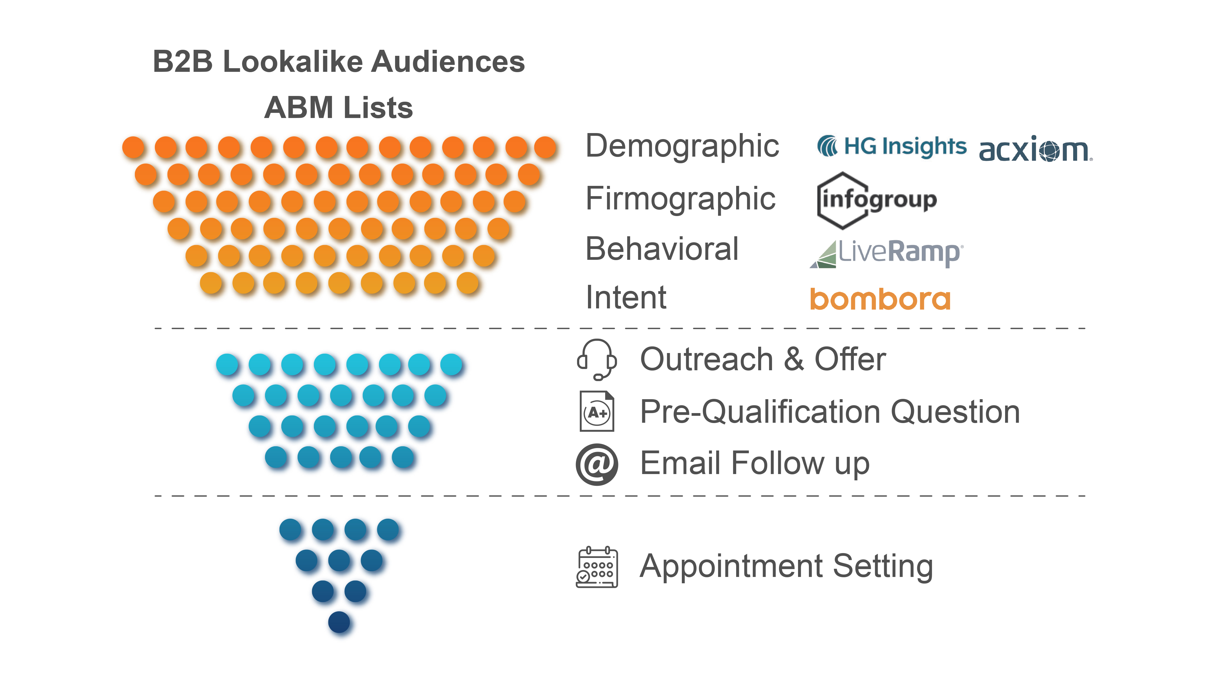
Explanation of image I drew on the whiteboard:
Top says: B2B Lookalike Audiences or ABM Lists
Data 1-4 can be replaced with the data companies used on slide 5 with the 5 data company logos there.
The next section is showing that there are fewer prospects. The tactics we do in this section are: Outreach & Offer, Pre-Qualification Question, Email Follow up
The 3rd section is Appointment Setting.
Target Market(s)
B2B enterprise level businesses
Industry/Entity Type
Digital Marketing
Font styles to use
Colors
Colors selected by the customer to be used in the logo design:
Look and feel
Each slider illustrates characteristics of the customer's brand and the style your logo design should communicate.
Elegant
Bold
Playful
Serious
Traditional
Modern
Personable
Professional
Feminine
Masculine
Colorful
Conservative
Economical
Upmarket
Requirements
Must have
- Must use a similar color scheme or a matching color scheme to my brand colors so it will look good both on the web pages as well as on presentation docs.