Digital publisher CMS design review and improvements
Want to win a job like this?
This customer received 13 web designs from 3 designers. They chose this web design from pb as the winning design.
Join for free Find Design Jobs- Guaranteed
-
 £120
£120
-
 13 designs
-
 3 designers
Web Design Brief
We have built a CMS and we need to address for UX/design items.
The main items we want to address are around font, hierarchy of headings to meet best practice.
For example the headings in blue are the same size as the text below, Also that same heading is used on the upload image,video,gallery items which is not right.
General
1) Fonts/size/headings
Article
1) I want to review the spacing of the options within the status box so that a user can more easily identify what options exist and can interact with them more easily
2) I want to review the text hierarchy across the article creation page so that the user can more easily scan the page and work out what can be interacted with
3) Save,publish buttons design - should there be a gap?
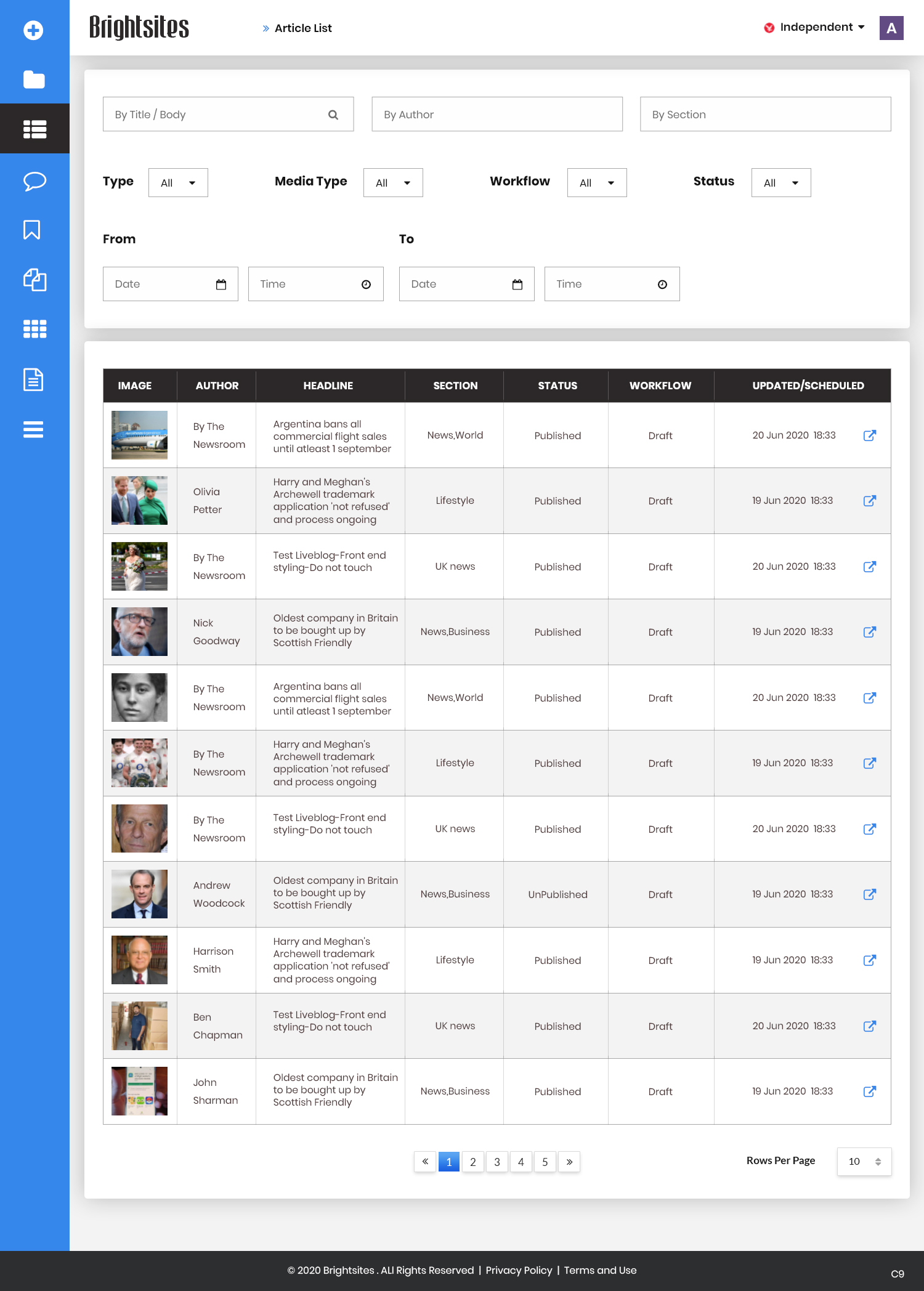
Article list
1) Make filters cleaner
2) Text hierarchy - hard to know where to focus
Updates
Slow in providing feedback
Target Market(s)
Editors of a CMS
Number of Pages Required
3 page
Look and feel
Each slider illustrates characteristics of the customer's brand and the style your logo design should communicate.