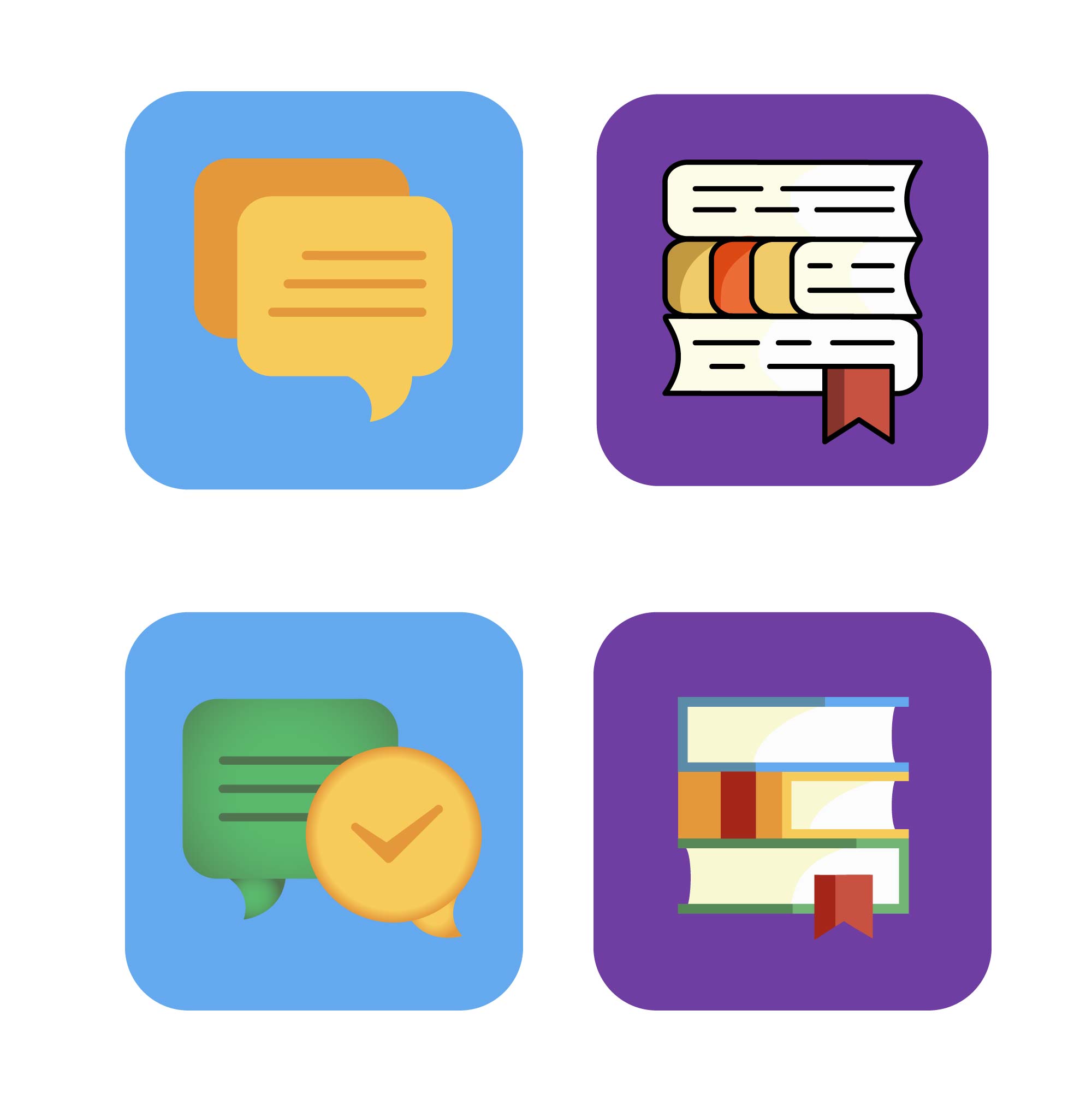
Two iOS app icons for a pair of Spanish language learning apps

Want to win a job like this?
This customer received 25 icon designs from 11 designers. They chose this icon design from kristina_saraseko 2 as the winning design.
Join for free Find Design JobsIcon Design Brief
We need two iOS app icon designs for a pair of Spanish language learning apps. These icons will be displayed in the iOS app store in the app product listings and on the user's device. Please see the attached file TemporaryPlaceholders.png for an example of two temporary, placeholder icons on the iOS home screen.
The first iOS app is called 'Aprendo', which translates as 'I learn' in Spanish. Aprendo teaches Spanish grammar, vocabulary, and verb conjugations. It is meant to be used any time, anywhere without requiring the user to speak out loud. I have attached Aprendo.zip, which contains screen shots from the app and the temporary placeholder icon that we are using. The temporary placeholder icon has a light bulb, but we would like to see other ideas for icons. The final design should communicate learning, knowledge, or studying. The primary color used in this app is #6f3ea2.
The second iOS app is called 'Hablo', which translates as 'I speak' in Spanish. Hablo teaches Spanish pronunciation, common phrases, and short conversations. Hablo uses speech recognition and recording and requires a user to produce Spanish speech in order to advance. I have attached Hablo.zip, which contains screen shots from the app and the temporary placeholder icon that we are using. The temporary placeholder icon has a microphone, but we would like to see other ideas for icons. The final design should communicate speech or speaking. The primary color used in this app is #64a9ee.
The apps will be advertised together as a suite of apps, so the two app icons should go well together. Most of the existing art in the apps uses vector art, so we would like to see vector art icons as well.
I have also attached a Website.zip, which contains a few screenshots of the early version of our website. This may provide additional context about the current look & feel of our products.
Here are some of the colors we have used in the apps and on our website. The designs do not necessarily have to use these colors, but they may be useful to consider:
green - #5ab86c
red - #c85141
purple - #6f3ea2
dark blue - #365f9a
light blue - #64a9ee
orange - #ed6c37
Updates
Went on vacation/holiday
Look and feel
Each slider illustrates characteristics of the customer's brand and the style your logo design should communicate.