Advertisement magazine cover page Travel Technology
Want to win a job like this?
This customer received 5 newspaper ad designs from 2 designers. They chose this newspaper ad design from ecorokerz as the winning design.
Join for free Find Design Jobs-
 €80
€80
-
 5 designs
-
 2 designers
Newspaper Ad Design Brief
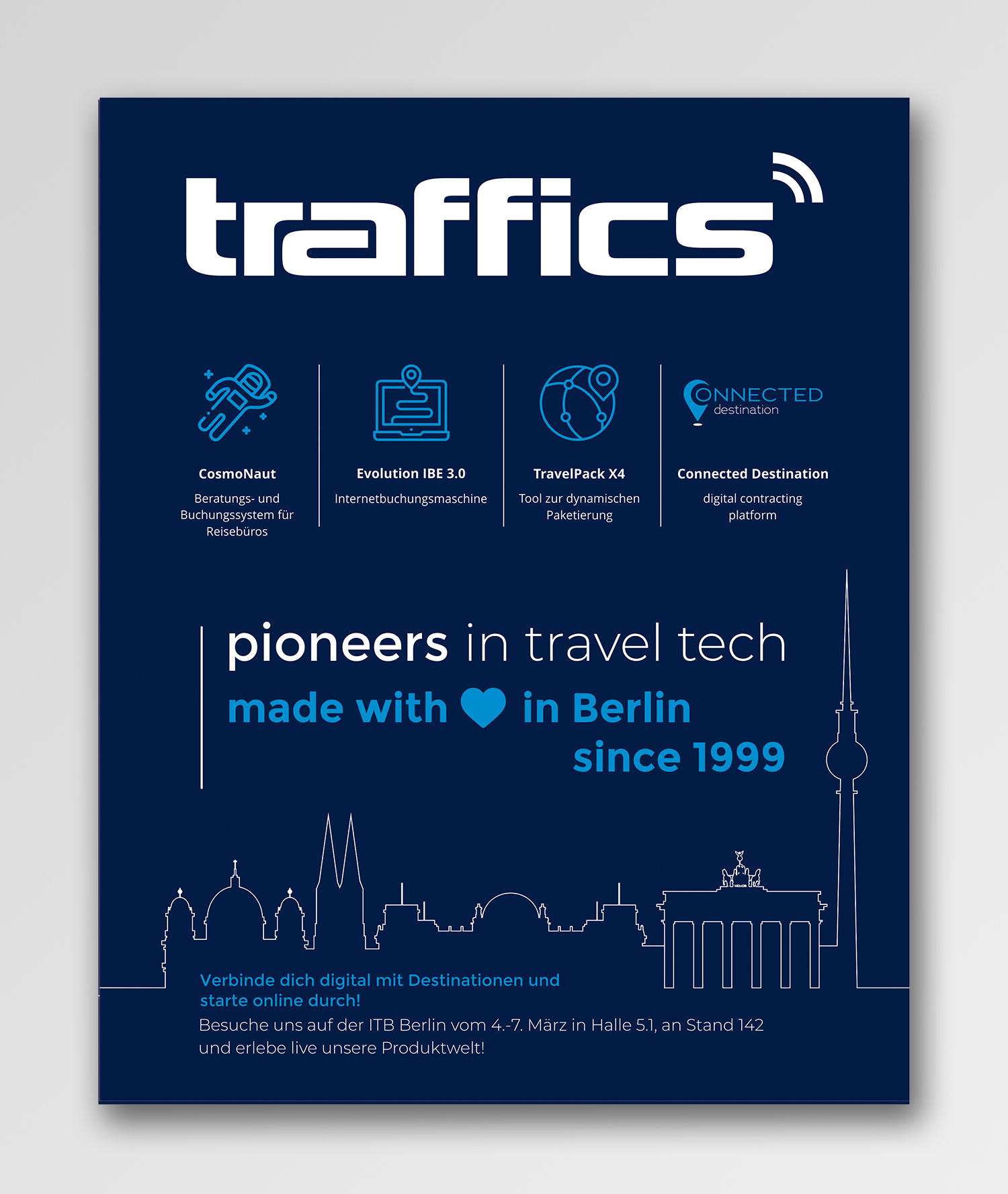
Briefly to us: We are a travel technology company, that means we develop software for the tourism industry, e.g. a consulting and booking system for% 26 # 252; for travel% 26 # 252 ; ros, a booking engine for travel portals etc. Our headquarters are in Berlin and we have been around since 1999. We need an advertisement for the cover page of a magazine (TouristikNews Germany) with the following dimensions: Format: 210 (width) x 260 mm (H% 26 # 246; he) With 3 mm circumferential bleeds Please deliver both as an open file and as a PDF. Target group: travel% 26 # 252; ros, destinations and the entire German-speaking travel industry. The magazine is laid out at a trade fair. Content: dark blue background traffics logo should be large% 26 # 223; and pr% 26 # 228; sent since we are the company, the rest are% 26 '' only% 26 '' our products please the icons and names with descriptions of the products as in example graphics (or% 26 # 228; similar) (traffics_Messestand) (without% 26 '' our product world% 26 ''!) in addition Skyline in white% 26 # 223; (unfortunately only available in blue as an open file, see exhibition stand file page 3 f% 26 # 252; r view in white% 26 # 223;) and slogans% 26quot; pioneers in travel tech% 26quot; in white% 26 # 223; and% 26 'made with love in Berlin since 1999% 26' (Heart instead of love) in lighter blue (see exhibition stand file on page 2-3, however, the S% 26 # 228; sentences should be in a row, one below the other, i.e. only the% 26 '' pioneers ...% 26 '' sentence and underneath the% 26quot; made with ...% 26quot; sentence. Sorry, we have no better example right now) If the% 26quot; Connected Destination% 26quot; Logo or the font can still be highlighted without looking bl% 26 # 246; d, gladly - but no constraint, maybe that will be too much. At the bottom or somewhere where it fits, preferably in a box or otherwise highlighted (without distracting from the products), it should still be:% 26 '' Connect digitally to destinations and start online! Visit us at ITB Berlin from 4th to 7th M% 26 # 228; rz in Hall 5.1, at Stand 142 and experience our product world live!% 26 '' The hue of the dark blue background is Pantone 281c (or% 26 # 228; similarly, we don't take that exactly;)). The deadline is unfortunately already on Friday, hence the time pressure.
Target Market(s)
Reiseb% 26 # 252; ros
Font styles to use
Colors
Colors selected by the customer to be used in the logo design:
Look and feel
Each slider illustrates characteristics of the customer's brand and the style your logo design should communicate.
Elegant
Bold
Playful
Serious
Traditional
Modern
Personable
Professional
Feminine
Masculine
Colorful
Conservative
Economical
Upmarket
Requirements
Must have
- see description