INVERTZ Bakery
Want to win a job like this?
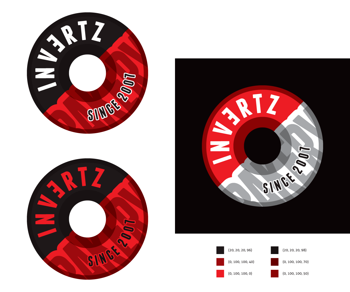
This customer received 70 logo designs from 27 designers. They chose this logo design from Kitchenfoil as the winning design.
Join for free Find Design Jobs- Guaranteed
-
 S$242
S$242
-
 70 designs
-
 27 designers
Logo Design Brief
Payment guaranteed.
Please download the file I've uploaded to get the feel of the logo i need.
Check updates for most recent feedbacks/changes by me.
Name of store: Invertz (Invert the "e" please? flip it horizontally)
What are we: A bakery owned by 2 ladies. We bake cakes, cupcakes, cake pops and tarts.
Target audience: 18-30 year old females
Brand colours: Black, white and red
Logo feel: Bold, loud, modern and sophisticated. Shouldn't give the "girlish" vibe.
Updates
I've updated the entire design brief and have included a file showing the kind of logos I'm looking out for from you guys. Please do have a look again. Thanks all!
Added Monday, January 20, 2014
We're currently getting several designs incorporating the use of the "dolly paper" because it's a bakery and we sell cakes. But if you have ideas beyond the "dolly party" emblem type logo, we would love to see that too. Thanks!
Added Tuesday, January 21, 2014
I'm also open to designs with two ladies in the logo!
Added Wednesday, January 22, 2014
Target Market(s)
18 - 30 year old females
Industry/Entity Type
Bakery
Logo Text
Invertz
Logo styles of interest
Emblem Logo
Logo enclosed in a shape
Pictorial/Combination Logo
A real-world object (optional text)
Abstract Logo
Conceptual / symbolic (optional text)
Look and feel
Each slider illustrates characteristics of the customer's brand and the style your logo design should communicate.
Elegant
Bold
Playful
Serious
Traditional
Modern
Personable
Professional
Feminine
Masculine
Colorful
Conservative
Economical
Upmarket
Requirements
Must have
- Invert the "e" in INVERTZ horizontally.
Colours should be red, black and white.
Nice to have
Should not have
- Should not give a "girlish" feel.