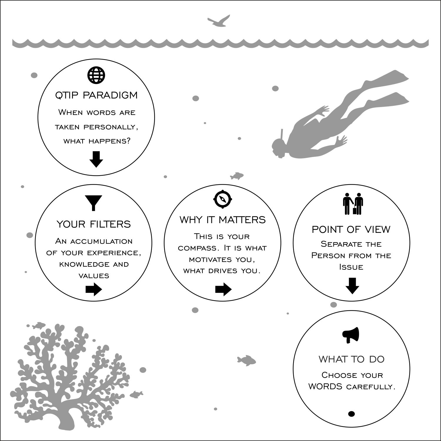
QTIP Paradigm. the way you communicate in every situation and in all environments.
Want to win a job like this?
This customer received 21 graphic designs from 7 designers. They chose this graphic design from ArtLex as the winning design.
Join for free Find Design Jobs-
 US$100
-
 21 designs
-
 7 designers
Graphic Design Brief
I would like you to create a diagram depicting a very specific process of communication. it must follow the look of the diagram that i have attached. this is going to be used in a book called CLARITY. it is going to explain the fact that we communicate all the same way using this process as we communicate. it starts with the fact that everyone takes everything that is said personally and then moves on to filters, which is your own agenda or experience kicking in. then you move to your why it matters, which is your motivation and ends with the choice of words you use when you communicate. if you are going to be successful then you must separate the person from the issue.
Target Market(s)
market is executive business people around the world
Industry/Entity Type
Consulting
Font styles to use
Colors
Designer to choose only greyscale colors for use in the design.
Look and feel
Each slider illustrates characteristics of the customer's brand and the style your logo design should communicate.
Elegant
Bold
Playful
Serious
Traditional
Modern
Personable
Professional
Feminine
Masculine
Colorful
Conservative
Economical
Upmarket
Requirements
Must have
- I would like it to have a diving/ocean/snorkel feel to it. The analogy we are using is to make a deep dive when you are communicating. it must have every part of the diagram you see, it starts at the top with the qtip paradigm (and the words) it then connects to the filters which connects to the why it matters with connects to the words and then end with the separating the person from the issue.
Nice to have
- we are writing a black and white book NO color. therefore the words should be clear and easy to read. Each section should be able to stand on its own so we can write about it separately.
Should not have
- the diagram DOES NOT have to look like the one i gave you. it must explain the fact that it starts with QTIP and ends with Separate and must pass through the three areas to get to the SEPARATE.