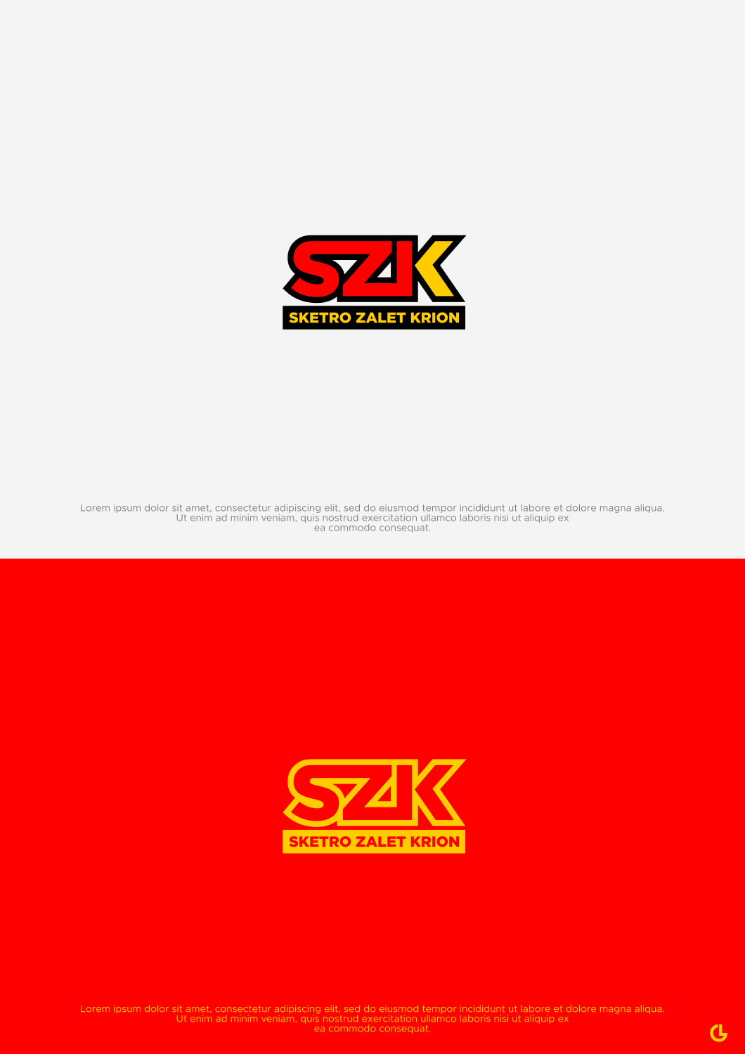
SZK Logo ( A redisgn of a old family supermarket logo)
Winner
Want to win a job like this?
This customer received 205 logo designs from 112 designers. They chose this logo design from R!CKY as the winning design.
Join for free Find Design Jobs- Guaranteed
-
 A$150
A$150
-
 205 designs
-
 112 designers
Logo Design Brief
I neeed you to bring and old family supermarket logo into the now.
Ideally having some refence to the old but with a fresh new take.
Ideally the traits of the old logo to shine within the new.
Main colours and shape to resemble the old with a new look font.
The key elements of the yellow background, red retangular shapes arond the letters and overall main shape of the logo to be similar.
Target Market(s)
Business is a private finance and real estate company.
Logo Text
SZK (Letters) Sketro Zalet Krion (Replace Supermarket)
Logo styles of interest
Wordmark Logo
Word or name based logo (text only)
Lettermark Logo
Acronym or letter based logo (text only)
Look and feel
Each slider illustrates characteristics of the customer's brand and the style your logo design should communicate.
Elegant
Bold
Playful
Serious
Traditional
Modern
Personable
Professional
Feminine
Masculine
Colorful
Conservative
Economical
Upmarket
Requirements
Nice to have
- SImalar fetaures to the old
Files
JPG
SSW.jpg
Thursday, August 29, 2019
Payments
1st place
A$150