Ron's Logo Project for Optimized Cryo +Wellness
Want to win a job like this?
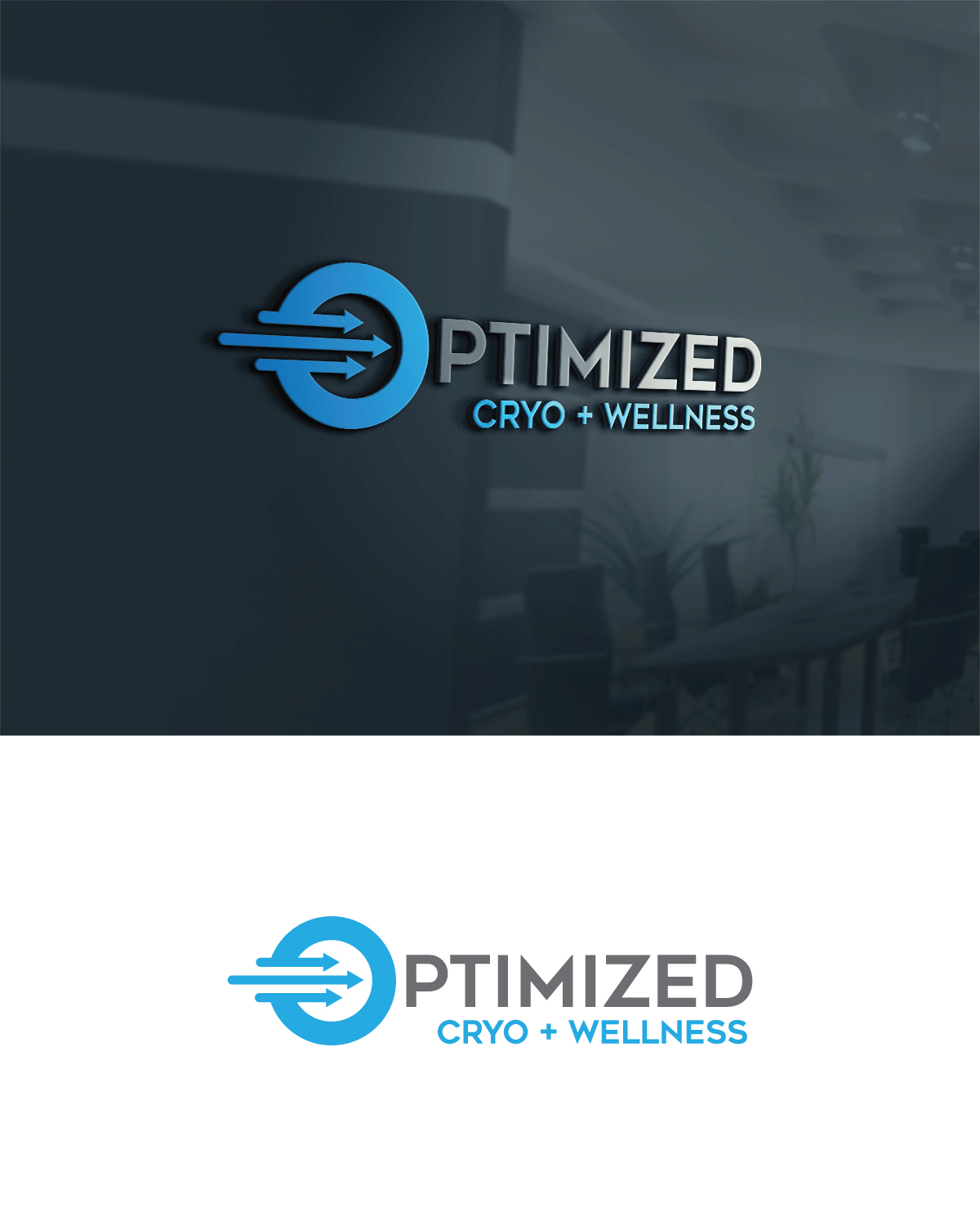
This customer received 333 logo designs from 127 designers. They chose this logo design from KK Graphics as the winning design.
Join for free Find Design Jobs- Guaranteed
-
 US$300
-
 333 designs
-
 127 designers
Logo Design Brief
PLEASE read this. Designers have been submitting symbols aside from the O in optimized that I requested. Also....it's NOT Optimized Cryo......and wellness.
Optimized
cryo +wellness
We'd like someone to come up with a really cool, clean looking, fun design for our new start up. Accentuating the letter "O" in Optimized somehow might be cool? Our purpose is to Optimize the lives of those who wish to become a better version of themselves. We'll offer Cryotherapy, IV drips, red light therapy, infra red sauna, and compression leg therapy and hyperbolic oxygen therapy. We're all about our helping our clients recover and optimize themselves.
Target Market(s)
Our customers are everywhere! Becoming Optimized is for everyone! Except for those currently under the care of a Physician or medical protocol, our therapies and services are to promote your personal Optimization goals! We will Optimize: student athletes, weekend warriors, the 9 to 5 professional, the stay at home parent, the small business owner, the college student, the everyday gym rat, the internet blogger, the YouTube star, the retiree, etc. If you’re sick and tired of being sick and tired, we will help you! If you’re currently working on getting Optimized or are already Optimized, we will also help you maintain that. Anyone who wishes to increase their overall optimal health, wellness, and vitality is our client.
Industry/Entity Type
Health And Wellness
Logo Text
Optimized Cryo + Wellness
Colors
Colors selected by the customer to be used in the logo design:
Look and feel
Each slider illustrates characteristics of the customer's brand and the style your logo design should communicate.
Elegant
Bold
Playful
Serious
Traditional
Modern
Personable
Professional
Feminine
Masculine
Colorful
Conservative
Economical
Upmarket
Requirements
Must have
- We are open to ideas. Optimized should probably stand out above from the Cryo+Wellness.
Nice to have
- I see the O being the trademark of the logo. Another designer had an arrow in the O, like the O was moving forward.