[Chinese] Tian Ci Fang Wine Industry - LOGO for Chinese Traditional Wine (Bottle Design)*
Want to win a job like this?
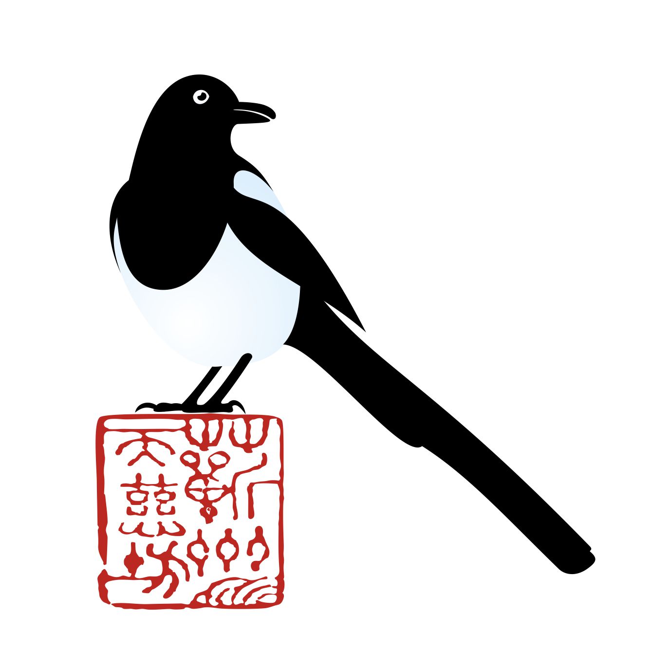
This customer received 115 logo designs from 26 designers. They chose this logo design from begovic.stefan as the winning design.
Join for free Find Design Jobs- Guaranteed
-
 US$160
-
 115 designs
-
 26 designers
Logo Design Brief
Our company's philosophy is to appreciate nature, diffuse traditional culture and provide consumers with unique quality products in the traditional Chinese wine market.
Company positioning: Healthy wine industry, natural, green and environmentally sustainable.
We are looking to design a original logo that the general public and traditional folks can easily associate with.
• Not from that of a royal or official/governmental association.
The elements of the logo require:
1. Graphic: Eurasian Magpie (Scientific Name: Pica pica) (Reference attached pictures.) In Chinese folk traditional culture, the magpie is the symbol of ascending greater heights and being auspicious, so the designs should bring out the primitive animated characteristics on top of a deep cultural root.
2. Chinese Stamp: Qi Zhou
Design idea 1: One magpie (Standing/Stopping) on the newly attached stamp
*The colour of the stamp and magpie is up to the designer to suggest
Updates
Slow in providing feedback
Target Market(s)
Healthy Wine Market, Traditional folks.
Industry/Entity Type
Winery
Logo Text
蕲州天慈坊
Logo styles of interest
Pictorial/Combination Logo
A real-world object (optional text)
Font styles to use
Other font styles liked:
- Chinese Calligraphy
Colors
Designer to choose colors to be used in the design.
Look and feel
Each slider illustrates characteristics of the customer's brand and the style your logo design should communicate.
Elegant
Bold
Playful
Serious
Traditional
Modern
Personable
Professional
Feminine
Masculine
Colorful
Conservative
Economical
Upmarket
Requirements
Must have
- The elements of the logo require:
- 1. Graphic: Eurasian Magpie (Scientific Name: Pica pica) (Reference attached pictures.) In Chinese folk traditional culture, the magpie is the symbol of ascending greater heights and being auspicious, so the designs should bring out the primitive animated characteristics on top of a deep cultural root.
- 2. Chinese characters: Qi Zhou (font see the picture).
- Design idea 1: One magpie (Standing/Stopping) on the newly attached stamp
- *The colour of the stamp and magpie is up to the designer to suggest
- Conditions:
- 1: Size of the magpie should be larger than the size of the seal.
- 2: The Magpie should be animated and alive, showing life and agility
- The Magpie should be front/side facing and the lines of its legs and claws should be softer. The Magpie should also be sleak and slimmer and its beak should be a little opened to demonstrate the liveliness of the magpie.
- 3: The version of the seal should the one that was last updated
- 4: The whole logo presents a good prosperous and auspicious feeling. Thank you!
Should not have
- 1, For above, No English or Pinyin should be used, only pure illustration and the chinese stamp
- 2, the use of logos: mainly used in the bottle of the product (glass bottles, porcelain bottles, pottery bottles), on the box, including all marketing collaterals.
- Challenges: The small logo on the bottle needs to highlight the aura of the magpie and needs to have a pop up or “alive” effect.
- 1: Size of the magpie should be larger than the size of the seal.
- 2: The Magpie should be animated and alive, showing life and agility
- The Magpie should be front/side facing and the lines of its legs and claws should be softer. The Magpie should also be sleak and slimmer and its beak should be a little opened to demonstrate the liveliness of the magpie.
- 3: The version of the seal should the one that was last updated
- 4: The whole logo presents a good prosperous and auspicious feeling. Thank you!