Recreate Frederick Douglass Graphic making it more usable.
Want to win a job like this?
This customer received 44 graphic designs from 16 designers. They chose this graphic design from DesignerGuide as the winning design.
Join for free Find Design Jobs-
 US$110
-
 44 designs
-
 16 designers
Graphic Design Brief
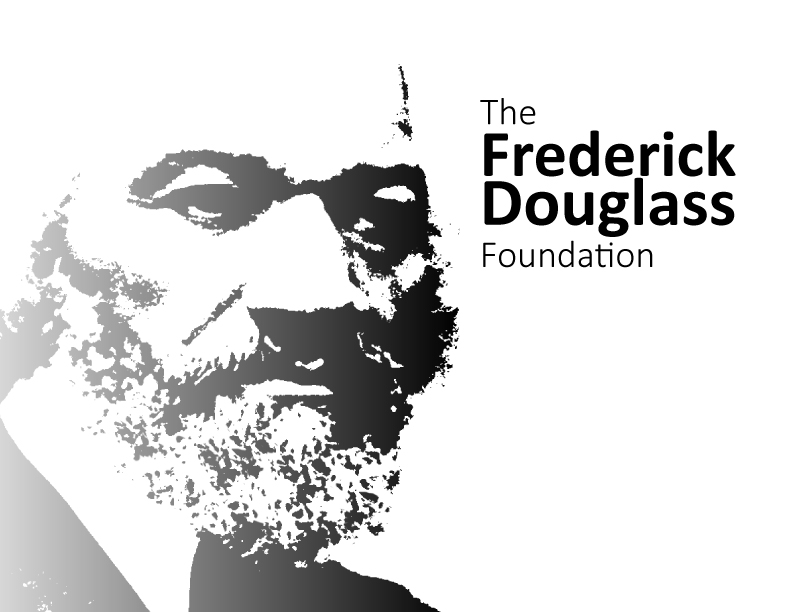
So the existing logo is the file named all those numbers. It looks decent at postage stamp size. Less than an inch. As it gets bigger there are just large shapes of gray and I hates that. I found the historical photo that the original was created from. What I need is a much larger high res version that includes more details and shapes so that it still looks like a stylized portrait at large sizes. I would also like the left side of the face to fade away instead of end in a hard edge.The “face” file I attached here is the best I could find to help visualize what the end result might look like. Shades of gray and graphic shapes. Somewhere in between my test file and actual historical photo.
Target Market(s)
All demographics
Industry/Entity Type
Political
Look and feel
Each slider illustrates characteristics of the customer's brand and the style your logo design should communicate.
Elegant
Bold
Playful
Serious
Traditional
Modern
Personable
Professional
Feminine
Masculine
Colorful
Conservative
Economical
Upmarket
Requirements
Must have
- Must be regal. Its important that FD is looking at the name The Frederick Douglass Foundation. It's as if he's looking over the organization. Strong Presences
Nice to have
- His hair is not as important as his face.