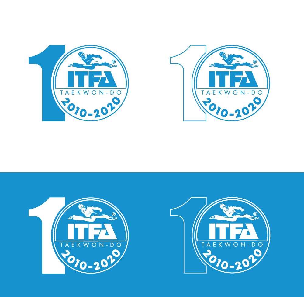
ITFA Taekwon-Do 10th Anniversary Logo
Want to win a job like this?
This customer received 88 logo designs from 37 designers. They chose this logo design from Clara passion as the winning design.
Join for free Find Design Jobs- Guaranteed
-
 A$120
A$120
-
 88 designs
-
 37 designers
Logo Design Brief
Our Taekwon-Do business celebrates its 10 year anniversary next year. we want a variation of our current logo to acknowledge this. It will be used on our website, social media, and on give aways. We basically want to add 2010-2020 and the number 10 but want some ideas of how this could be done in a professional way. There could also be some other variation to the logo that would make it stand out from the usual version. It would need to work in it's original colour, united nations blue, black, white and maybe in silver as something different.
Taekwon-Do is a Korean Martial Art therefore any circles need to complete rings as a broken ring means disruption and is a negative symbol
Target Market(s)
Taekwon-Do Practitioners
Industry/Entity Type
Martial Art
Logo Text
Add 2010-2020 and the number 10 in someway to the logo
Colors
Colors selected by the customer to be used in the logo design:
Look and feel
Each slider illustrates characteristics of the customer's brand and the style your logo design should communicate.
Elegant
Bold
Playful
Serious
Traditional
Modern
Personable
Professional
Feminine
Masculine
Colorful
Conservative
Economical
Upmarket
Requirements
Must have
- Must be a variation of our current logo so it's easily recognisable
Nice to have
- Still have the split kick man in the design (this is our registered trademark so please don't change it) and the wording ITFA Taekwon-Do, 2010-2020 but doesn't have to be like the original layout
Should not have
- multiple colours in the design - one colour