SANS! Sub brand Logo for staff restaurants
Want to win a job like this?
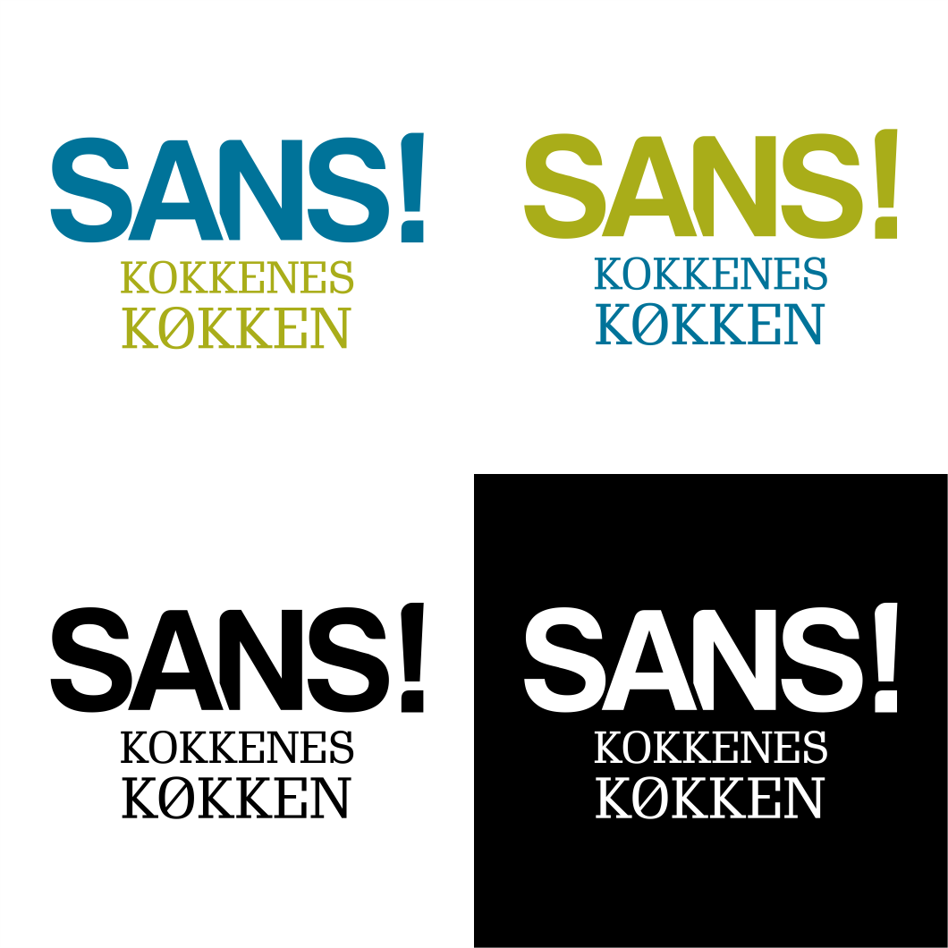
This customer received 84 logo designs from 38 designers. They chose this logo design from rianto.ade as the winning design.
Join for free Find Design Jobs-
 €110
€110
-
 84 designs
-
 38 designers
Logo Design Brief
A logo for a new canteen/ staff restaurant concept. Our client runs staff restaurants and canteens in Denmark, serving more than 50.000 people each day. SANS in Danish means Sense. The chefs at the restaurants works with an approach to stimulating all senses, hence leveraging the taste of the food. We focus on better quality rather than a large selection of dishes, home cokked food and a friendly, homely and cosy atmosphere to leverage the meal. Must be a sub-brand logo to existing concept Kokkens Køkken, see attached logo.
Target Market(s)
Guests in canteens and staff restaurants run by Kokkenes Køkken/SANS
Logo Text
SANS!
Logo styles of interest
Emblem Logo
Logo enclosed in a shape
Pictorial/Combination Logo
A real-world object (optional text)
Wordmark Logo
Word or name based logo (text only)
Lettermark Logo
Acronym or letter based logo (text only)
Look and feel
Each slider illustrates characteristics of the customer's brand and the style your logo design should communicate.
Elegant
Bold
Playful
Serious
Traditional
Modern
Personable
Professional
Feminine
Masculine
Colorful
Conservative
Economical
Upmarket
Requirements
Must have
- Need to be aligned with existing logo - but should stand out as an individual brand
Should not have
- Please no chefs hats or other to direct references to cooking. Danish approach is more subtle and lean