Old logo Members didn’t understand and the new logo is too plain and boring
Winner
Want to win a job like this?
This customer received 55 logo designs from 26 designers. They chose this logo design from K-Ranj design as the winning design.
Join for free Find Design Jobs-
 A$150
A$150
-
 55 designs
-
 26 designers
Logo Design Brief
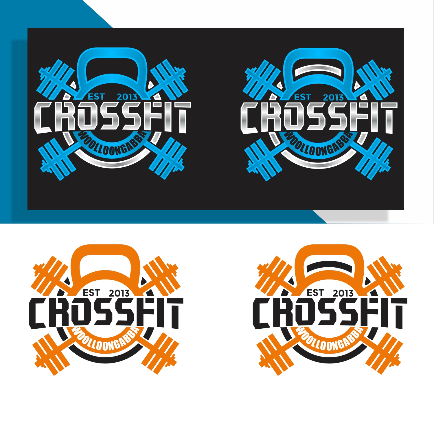
The old logo have a gas mask in it and the members didn’t really understand the meaning of it. I’ve attached a picture of it. A friend has done a basic design of something but I feel it’s too clipart . I want something that has the cross fit barbells maybe weights cattle bells something that looks good can be more detailed. Going to be put on Billboard, shirts etc
Target Market(s)
People between age 18-40 guys and
Logo Text
Crossfit woolloongabba EST 2013
Logo styles of interest
Emblem Logo
Logo enclosed in a shape
Character Logo
Logo with illustration or character
Colors
Colors selected by the customer to be used in the logo design:
f78f20
Look and feel
Each slider illustrates characteristics of the customer's brand and the style your logo design should communicate.
Elegant
Bold
Playful
Serious
Traditional
Modern
Personable
Professional
Feminine
Masculine
Colorful
Conservative
Economical
Upmarket
Requirements
Must have
- Crossfit Woolloongabba and Est 2013
Nice to have
- I like the idea of having the barbells maybe with weights on it as well as the Kettlebell the new design just looked a bit simple. But I’m open to new ideas
- My current design a black white and orange but I like the idea of Being able to change the colour if it’s guys or girls or if I want to printed on different coloured shirts. It doesn’t have to be one colour maybe up to 3
Should not have
- I don’t really like Silhouette in logo designs
Files
Download all files - 5.4 MBJPEG
8E88EF25-3DA9-4F36-BE5E-43143B69BA5C.jpeg
Wednesday, June 5, 2019
JPEG
A0F5068D-7533-41E9-A4C5-1B36A3A5363F.jpeg
Wednesday, June 5, 2019
Payments
1st place
A$150