Frankston Brewhouse Beer Can Design
Want to win a job like this?
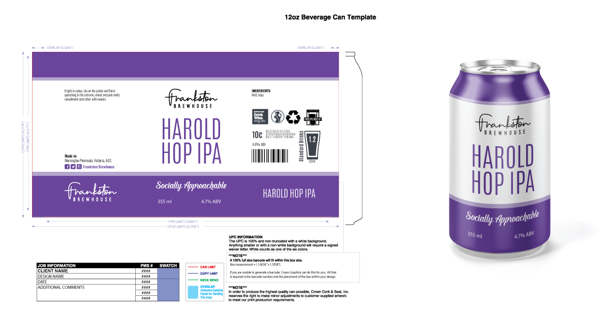
This customer received 109 packaging designs from 37 designers. They chose this packaging design from Sergio Coelho as the winning design.
Join for free Find Design Jobs- Guaranteed
-
 A$190
A$190
-
 109 designs
-
 37 designers
Packaging Design Brief
Design a beer can for a boutique craft brewery located in Frankston, Victoria, AUS.
We have a focus on producing socially approachable beers in an ambient setting. The beer can design should be sophisticated, simple, recognizable and a little playful. The color pallet should be inviting and not too bold. The design should have identifying features that can be interchanged onto different cans for different beer types. The design must be repeatable for other beer varieties, which will each have a unique color. The can should feature black, white and purple (this should be in interchangeable color). The beer can also needs to have our Frankston Brewhouse company logo on it, this has been attached to the design brief.
Target Market(s)
The target market is aged 25+ who are social, have some disposable income and appreciate good beer, wine and food.
The beers will also be made for distribution, initially to locally to restaurants and cafés and eventually commercially.
Tourists will also be targeted due to the area the brewhouse is located (Mornington Peninsula, Victoria, AUS).
Industry/Entity Type
Hospitality
Font styles to use
Colors
Colors selected by the customer to be used in the logo design:
Look and feel
Each slider illustrates characteristics of the customer's brand and the style your logo design should communicate.
Elegant
Bold
Playful
Serious
Traditional
Modern
Personable
Professional
Feminine
Masculine
Colorful
Conservative
Economical
Upmarket
Requirements
Must have
- The ‘Frankston Brewhouse’ logo.
- The colour associated to this beer - purple. This should be the only colour used on the can (along with black/white/gray).
- The company tagline ‘Socially Approachable’.
- The tasting notes text ‘Bright in colour, dry on the palate and thirst quenching in the extreme, wheat and pale malts compliment each other with nuance.’
- Australian beer can requirements as per 'Requirements.png'. EPS and AI files of the requirements have been included.
Nice to have
- The logo text ‘Harold Hop IPA’ more predominant than the Frankston Brewhouse logo.
Should not have
- Be busy, simple is best
- Beer related pictures / images
- Bold, masculine lines and fonts
- Requirements.png directly used. Please use the EPS or AI files provided.