Basic Educational Organisation Logo
Want to win a job like this?
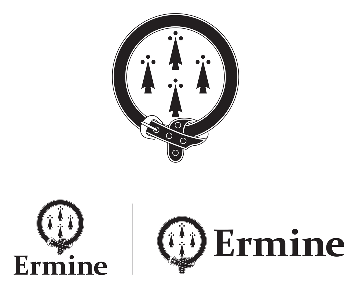
This customer received 86 logo designs from 15 designers. They chose this logo design from Ekanite as the winning design.
Join for free Find Design Jobs-
 US$200
-
 86 designs
-
 15 designers
Logo Design Brief
Logo for an educational organisation.
Must be only pure black and pure white (no grey).
Must include an ermine spot of this sort of style: http://armorial.library.utoronto.ca/sites/default/files/styles/medium/public/ermine%20spot.jpg?itok=nRLK8ugP or http://i474.photobucket.com/albums/rr101/xkaytelle/erminespot.gif.
Could be a pattern of spots or one bold one. The spot must be the main feature of the logo.
The name of the organisation is "Ermine", if you wish to include the name. The official typeface is Constantia.
The logo will need to printed on signs as well as business cards. The logo should be bold, very simple and memorable.
Updates
It would be good if someone tried the garter idea (see Nice to Have section).
Added Friday, January 10, 2014
Target Market(s)
Parents of school-aged children.
Industry/Entity Type
Business
Logo styles of interest
Emblem Logo
Logo enclosed in a shape
Abstract Logo
Conceptual / symbolic (optional text)
Font styles to use
Look and feel
Each slider illustrates characteristics of the customer's brand and the style your logo design should communicate.
Elegant
Bold
Playful
Serious
Traditional
Modern
Personable
Professional
Feminine
Masculine
Colorful
Conservative
Economical
Upmarket
Requirements
Must have
- Possibility to vectorise without loss of quality.
Ermine spot/s.
Nice to have
- I like the idea of spots being surrounded by a heraldic garter. (see http://www.southampton.ac.uk/assets/imported/transforms/peripheral-block/LinkImage/E5C3B9F5A9D94A739407681B2B63CC55/170px-Oxford-University-Circlet_svg.png_SIA%20-%20JPG%20-%20Fit%20to%20Width_172_true.jpg)
Should not have
- Spots in a shield.
Colours other than black and white.
Complex patterns.