Personal tax, financial planning and investment management firm requires modernized & redesig...
Want to win a job like this?
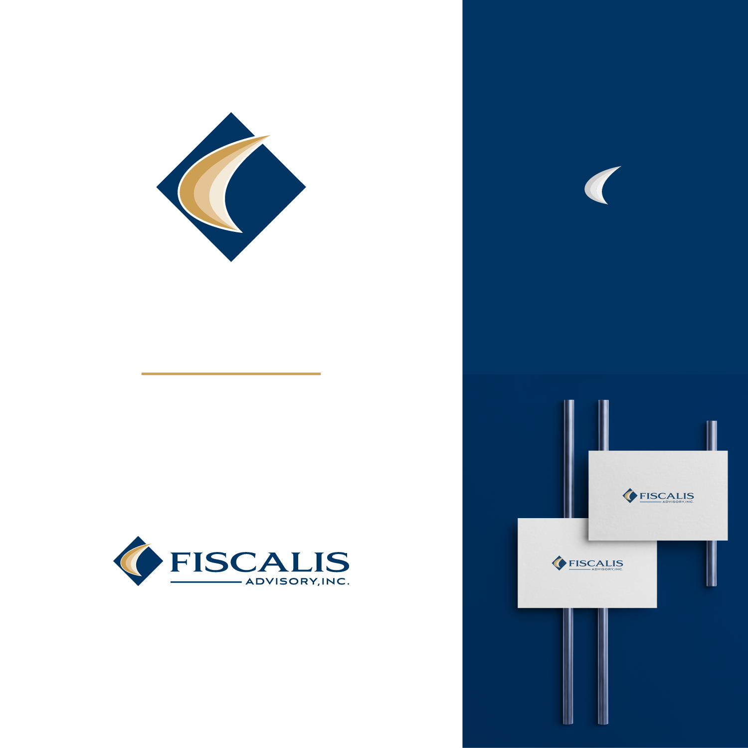
This customer received 412 logo designs from 128 designers. They chose this logo design from NilavroShuvro as the winning design.
Join for free Find Design Jobs- Guaranteed
- Bundled Project 2
-
 US$400
-
 412 designs
-
 128 designers
Logo Design Brief
We are a professional tax, financial planning and investment management firm providing fiduciary level services to clients. We are NOT a SALES company. We are professional advisors, working in our client's best interests. To eliminate conflicts of interest, we do not participate in any product sales. Its unfortunate we have to make this distinction, but we do. Our final design needs to project stability, and trustworthiness. At this point,I'd like to keep using our current colors and am not wedded to anything else about the current logo and font. You can view the current logo and firm colors at www.fiscalisadvisory.com
Updates
Gathering more feedback
Target Market(s)
Successful individuals and families
Industry/Entity Type
Financial Planning
Contact Information for Business Card
Text on single side with complementing color on the reverse.
Logo Text
Fiscalis Advisory, Inc.
Logo styles of interest
Pictorial/Combination Logo
A real-world object (optional text)
Abstract Logo
Conceptual / symbolic (optional text)
Lettermark Logo
Acronym or letter based logo (text only)
Font styles to use
Look and feel
Each slider illustrates characteristics of the customer's brand and the style your logo design should communicate.
Elegant
Bold
Playful
Serious
Traditional
Modern
Personable
Professional
Feminine
Masculine
Colorful
Conservative
Economical
Upmarket
Requirements
Must have
- See the colors in use at www.fiscalisadvisory.com - primarily the blue and gold in the logo itself. I can provide CMYK codes if necessary. Any logo graphic must work the rest of the layout and not over power the FISCALIS name.
Nice to have
- Check file named EFrontier. Would like to see and icon built on a series of these shapes perhaps in an overlapping fan format where each one pivots off the base and gets a bit steeper along the left edge. If we call this shape a "swoosh" perhaps gold swooshes against a blue background. I think a translucent effect where the left edge of the swoosh is the darkest might be interesting, however, abstraction and artistic design interpretation is appreciated! This figure represents a fundamental concept in my profession where the steeper the upward slope on the left hand side represents a better result. Therefore this is something we aim to provide for our clients. A series of these in a set of three swooshes where each one moves up and to the left is a better result. The idea is to start lower and move higher showing improved results.
Should not have
- It seems I'm less inclined to like a graphic icon created from the use of letters taken from the firm name (F, A, etc). So far, I prefer symbols that evoke ideas of movement, improvement, progress, growth, balance and symmetry.
Files
Download all files - 0.3 MBPayments
Total
US$400
Project Deadline
27 Apr 2019 18:09:28 UTCProject Upgrades
Bundled project(s)
- offering US$39 business card design to winner
- offering US$49 stationery design to winner