A logo innovative yet conservative!
Want to win a job like this?
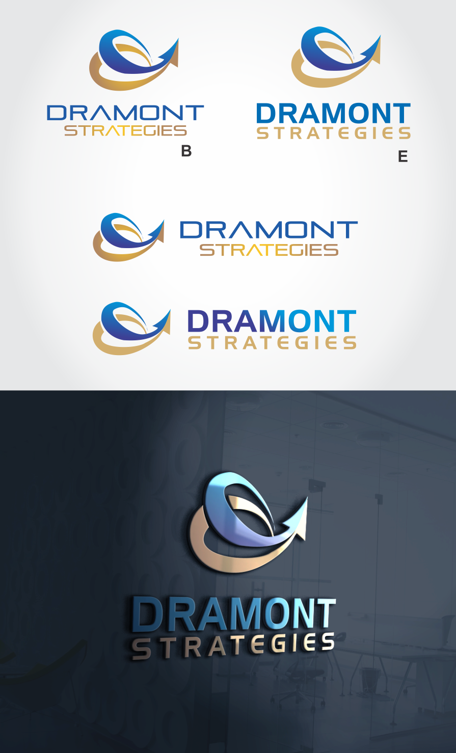
This customer received 117 logo designs from 40 designers. They chose this logo design from ariltatum as the winning design.
Join for free Find Design Jobs-
 C$150
C$150
-
 117 designs
-
 40 designers
Logo Design Brief
The name of my company is Dramont Strategies Inc. We provide consulting services to help our customers transform their business, implement new processes, experience simpler innovative approach to otherwise complex business processes. Where transformation is perceived complex we make it simpler to understand and organized around reliable and feasible roadmaps. Dramont is a real peninsula in real life. The name was chosen to represent our ability to be up front in the sea, in advance of the rest of the crowd yet connected to the core reality of day to day businesses like a peninsula is connected to a continent. The logo should transpire this analogy. Should be lean as we are lean consultants, forward looking simple. the following sites shows terms that matches what we do: https://depositphotos.com/search/business-technology-transformation.html https://depositphotos.com/search/strategic-planning.htmllooking for a small logo that will fit on a business card and standard documents at first.thxPS: Dramont is a cape too, stands strong in the sea: https://c8.alamy.com/comp/CNAX0R/france-var-esterel-saint-raphael-hamlet-dramont-island-gold-and-saracen-CNAX0R.jpg
Target Market(s)
Senior Executives of mid to large companies
Logo Text
Dramont Strategies
Logo styles of interest
Pictorial/Combination Logo
A real-world object (optional text)
Abstract Logo
Conceptual / symbolic (optional text)
Font styles to use
Colors
Designer to choose colors to be used in the design.
Look and feel
Each slider illustrates characteristics of the customer's brand and the style your logo design should communicate.
Elegant
Bold
Playful
Serious
Traditional
Modern
Personable
Professional
Feminine
Masculine
Colorful
Conservative
Economical
Upmarket
Requirements
Nice to have
- 2-3 colors to reference sea sun earth!
Should not have
- too much graphical elements