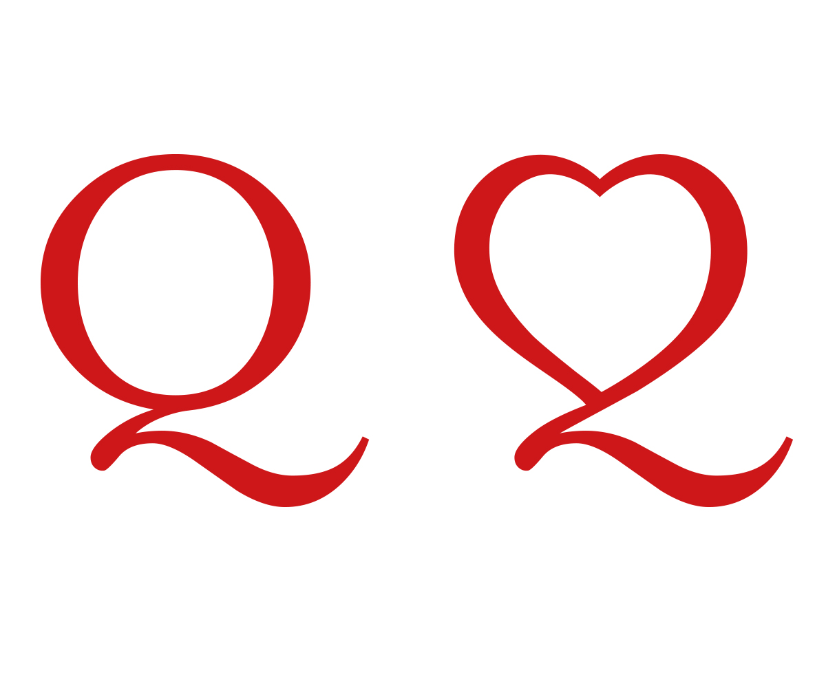
“Q/Heart” Letterform/Logo Design
Want to win a job like this?
This customer received 19 graphic designs from 12 designers. They chose this graphic design from COTTA - STUDIO as the winning design.
Join for free Find Design Jobs- Guaranteed
-
 US$110
-
 19 designs
-
 12 designers
Graphic Design Brief
NEED: A “Q’ letterform, reflecting the literal design attributes of the classic transitional serif font, Mrs. Eaves Regular– incorporating an outline heart symbol in place of the "Q" standard oval form, while maintaining its signature decorative tail stroke. The outline of the heart shape should reflect the appropriate thick/thin ratio aspects of the Mrs. Eaves letterform. A challenge will be to keep the point of the heart’s bottom separated slightly from the tail (see rough proof of concept sample provided – not to be mimicked, but rather to be significantly improved upon). The sample shows the top and bottom of the heart design to be unconnected, but the final product should NOT reflect this. The end result needs to look like a graceful, formally constructed letterform from the Mrs. Eaves family.
The color should be red, C15/M100/Y100/K0
Final format to be vector .eps + layered project file
Target Market(s)
N/A
Font styles to use
Other font styles liked:
- Mrs. Eaves
Colors
Colors selected by the customer to be used in the logo design:
Look and feel
Each slider illustrates characteristics of the customer's brand and the style your logo design should communicate.