New Logo for New Law Firm Brand
Want to win a job like this?
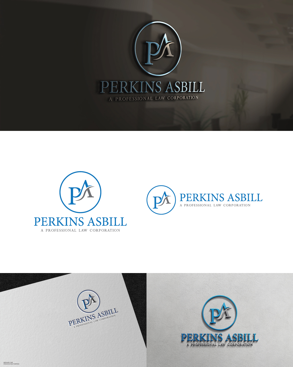
This customer received 257 logo designs from 103 designers. They chose this logo design from stephen 16 as the winning design.
Join for free Find Design Jobs- Guaranteed
-
 US$150
-
 257 designs
-
 103 designers
Logo Design Brief
Long-time Employment & Business Litigation Law Firm, Perkins & Associates is rebranding to Perkins Asbill. Please see the current logo here: https://www.perkins-lawoffice.com/
Please view the files showing the 1st attempt of a local designer. The firm felt these were "OK" but is looking for something more. Files are here: https://www.dropbox.com/sh/xt9aa066my0pc0l/AAB4fuQFCjABAf1km0fQF2cGa?dl=0 - AGAIN these are NOT to follow. Looking for something different, yet professional.
They are looking for something more original, more stand out, more modern, BUT NOT TOO FLASHY OR CRAZY so that it doesn't become dated super quick. It must be professional and clean looking.
The logo needs to be something that will last for many years to come, timeless, yet have a fresh clean look.
A more creative logo mark using the P and the A would be good.
A new website will be created for the new brand, but will not look anything like the current website, so DO NOT use that for reference.
Logo Text
Perkins Asbill
Colors
Designer to choose colors to be used in the design.
Look and feel
Each slider illustrates characteristics of the customer's brand and the style your logo design should communicate.
Elegant
Bold
Playful
Serious
Traditional
Modern
Personable
Professional
Feminine
Masculine
Colorful
Conservative
Economical
Upmarket
Requirements
Must have
- Professional, law firm look. Must have a square and a rectangle version.
Nice to have
- A well thought out design and logo mark that would stand out among the best law firm logo designs.
Should not have
- Something to plain or ordinary.