EM3
Want to win a job like this?
This customer received 138 logo designs from 63 designers. They chose this logo design from Plrtmjnto as the winning design.
Join for free Find Design Jobs- Guaranteed
-
 US$300
-
 138 designs
-
 63 designers
Logo Design Brief
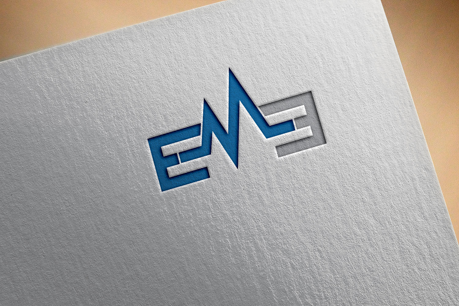
EM3 is a medical (emergency medicine) conference, to be presented by third year doctors (residents).
That's why it says EM (emergency medicine) and 3 (year of the residents presenting it).
I need a logo for it that's simple but clever. For example, the "E" and the "3" is are opposing and you can play with their lines to intersect in a beautiful or a way that can mean something if someone would focus on it for a while.
Another example is the "M" being like a heart tracing in a good way (please check out the real shape of a heart tracing if you chose to go that way).
I'm sure you can find a lot of creative ways to design it.
Make it simple.
Colors are an important factor, and the "3" is easy to play around in the area.
Please I can't stress the clever aspect high enough.
Target Market(s)
Doctors
Logo styles of interest
Lettermark Logo
Acronym or letter based logo (text only)
Font styles to use
Colors
Designer to choose colors to be used in the design.
Look and feel
Each slider illustrates characteristics of the customer's brand and the style your logo design should communicate.
Elegant
Bold
Playful
Serious
Traditional
Modern
Personable
Professional
Feminine
Masculine
Colorful
Conservative
Economical
Upmarket
Requirements
Must have
- Clever sense.
- Doctor-related.
- *Clever twist* (really important)
Nice to have
- Intersecting lines a in a playful and eye-comforting way.
- Pay special considerations to the fact it will be printed on shirts, cards, vinyl, and so many things later on.
Should not have
- Plain text.