40 is the new 20: How to make your 40s the best years of your life
Want to win a job like this?
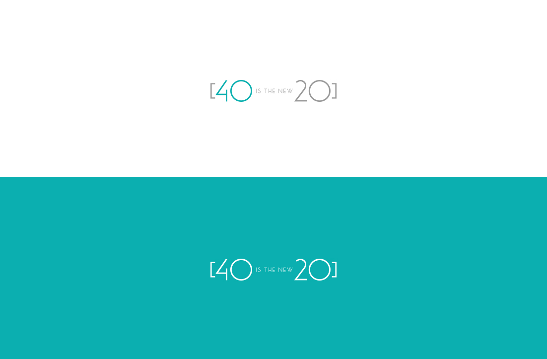
This customer received 195 logo designs from 104 designers. They chose this logo design from GLDesigns as the winning design.
Join for free Find Design Jobs- Guaranteed
-
 US$300
-
 195 designs
-
 104 designers
Logo Design Brief
I need a logo for my brand 40 is the new 20. My main audience is women between 35 and above who are looking to live a healthier life. We give tools to be better mentally, physically and with nutrition. We do a lot of fitness but not so much yoga or pilates related. This movement is more edgy and with practical tips for the active woman. We have been using a very simple design we made at home, but now its time to create professional logo. We will be using logo on presentations, social media and also on some merchandise like t-shirts, hats, and batting suits.
Target Market(s)
My main audience is women between 35 and above who are looking to live a healthier life. They want to look good and feel great!
Logo Text
40 is the new 20
Logo styles of interest
Pictorial/Combination Logo
A real-world object (optional text)
Character Logo
Logo with illustration or character
Wordmark Logo
Word or name based logo (text only)
Font styles to use
Colors
Colors selected by the customer to be used in the logo design:
Look and feel
Each slider illustrates characteristics of the customer's brand and the style your logo design should communicate.
Elegant
Bold
Playful
Serious
Traditional
Modern
Personable
Professional
Feminine
Masculine
Colorful
Conservative
Economical
Upmarket
Requirements
Must have
- I like teal color and you can combine with any other color
Nice to have
- It must have the full name 40 is the new 20