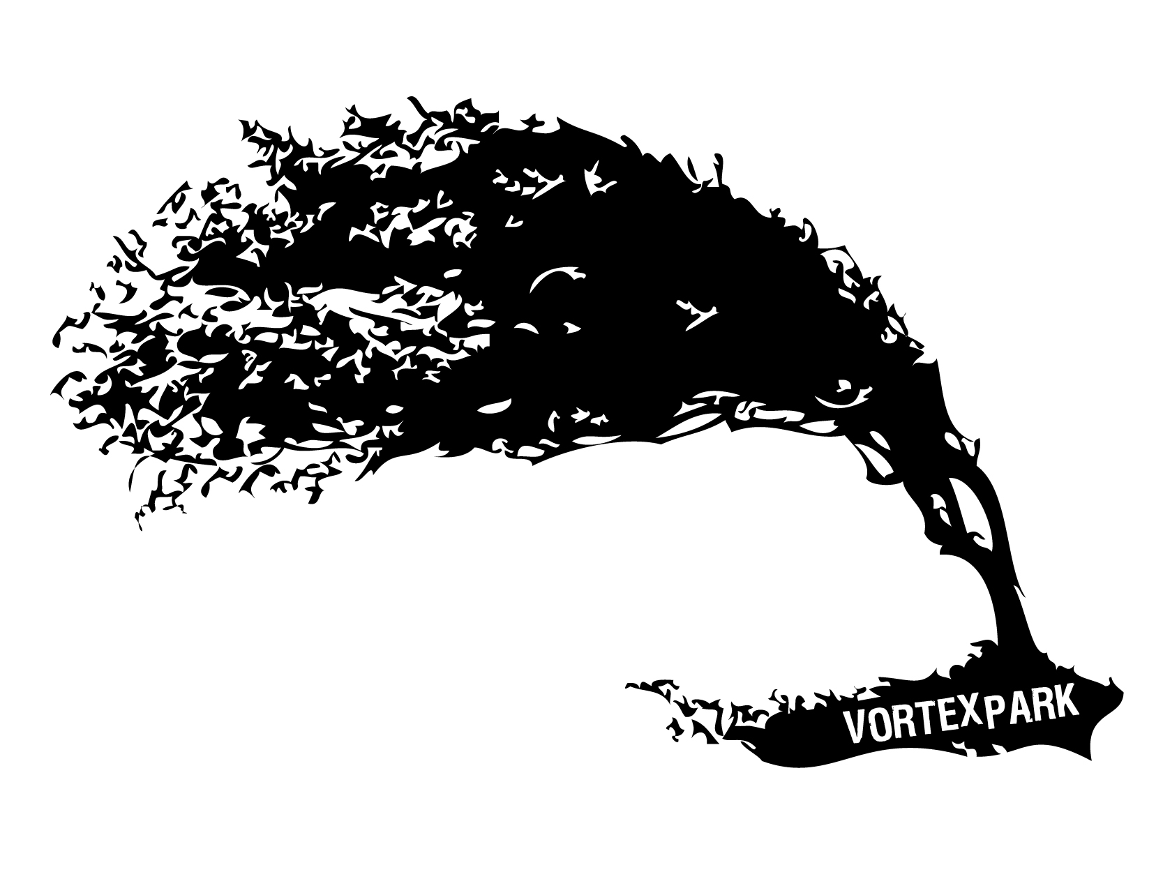
"Vortex Park" Band Logo/Icon
Want to win a job like this?
This customer received 175 logo designs from 57 designers. They chose this logo design from Alex Wolf as the winning design.
Join for free Find Design Jobs- Guaranteed
-
 US$500
-
 175 designs
-
 57 designers
Logo Design Brief
Vortex Park is an Atlanta, GA, USA based music group formed in 2004. The music is very unique and eclectic: a fusion of jazz, gypsy jazz, folk and rock. The band is currently recording their first full-length album which is being produced by a "big league" producer and is due out summer 2010. This album will introduce our new, bigger, fuller and more electric sound - and we wish to release the album with a new logo that represents the music artistically and appropriately.
The writing style of the music is very unique, poetic, emotional, organic, evolutionary, sometimes politically charged, sometimes dark, sometimes tender and caring, and has lots of depth and texture (lyrically & sonically). Our live show is very energetic and dramatic. The skill level of the musicianship is advanced. The arrangement is a lead singer, electric guitar, violin, upright bass, drums and percussion. An older, acoustic (pre-electric) live album can be heard here: http://www.vortexpark.net/music
We are looking to come up with an icon, so that the name, Vortex Park, may or may not always be illustrated with that icon. We also would like for the designer to consider the lettering of the name to be illustrated (other than just a font) so that if we use the name without the icon, it is also unique. We are not opposed to the icon not having any direct correlation to the name, though one that requires some intellect in order to be understood might be interesting. We also don't mind if "Vortex Park" is represented subtly compared to the icon when they are coupled together.
Currently, our website is tailored specifically to only promote the pre-sale of our upcoming release (http://www.vortexpark.com) but in order to better get a sense of our project, feel free to browse around here: http://www.vortexpark.net/sitemap and of course we are on Facebook, as well.
The band was named impulsively (and was available as a ".com") though it has taken a life of its own. The violinist's father wrote, "A park can be construed as a gathering place for people/things/activities, and a vortex brings to mind whirlpools, energy coming together, different matter/ideas being combined into one....so [Vortex Park] is a gathering place for varied influences and musical ideas, coming out as one."
If we had to describe the sentiment of our project with one sentence, it would be the following: "We are cynics with hope."
Target Market(s)
Our fan base spans a wide demographic, though we are targeting a little more of a sophisticated/educated music listener ages 18-40. Although our music has a niche audience and we recognize that we are not "pop", we do want our image to be accessible to as wide of an audience as possible without compromising the integrity of the movement.
Logo Text
Vortex Park
Logo styles of interest
Emblem Logo
Logo enclosed in a shape
Pictorial/Combination Logo
A real-world object (optional text)
Abstract Logo
Conceptual / symbolic (optional text)
Character Logo
Logo with illustration or character
Look and feel
Each slider illustrates characteristics of the customer's brand and the style your logo design should communicate.
Elegant
Bold
Playful
Serious
Traditional
Modern
Personable
Professional
Feminine
Masculine
Colorful
Conservative
Economical
Upmarket
Requirements
Must have
- The logo/icon needs to translate well to all kinds of print, tee-shirts, and stitching for hats and merchandise. It can be multi-colored, but should be able to be represented easily with one-color, as well.
Nice to have
- We want the logo/icon to be something so freaking cool that someone would want it on a shirt, even if they had no idea it was a band.
Should not have
- The only concept that we do want to stay away from is an obvious "spiral" or vortex - just seems cheesy to us and overdone.