Dynamic strong logo for a company for the fetish / BDSM industry.
Want to win a job like this?
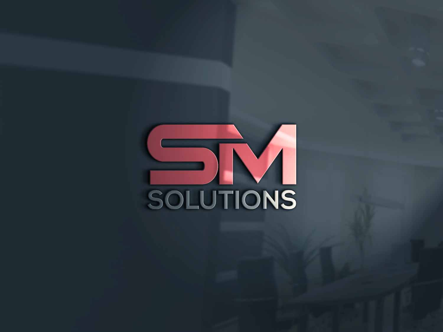
This customer received 172 logo designs from 92 designers. They chose this logo design from axel xhone 1 as the winning design.
Join for free Find Design Jobs- Guaranteed
-
 €190
€190
-
 172 designs
-
 92 designers
Logo Design Brief
BDSM and fetish scene.The color should be black and gray and anthracite tones or muted in red tones -not too garish or too red / yellow. Rather then in the darker, noble red. The company specializes in fine products and the logo should reflect that. But so be very present. The last picture is already a logo version of ourselves. The 3-dimensional is so attractive. Overall the logo should be marcastic and strong, already from a distance. The word: solutions does not have to be recognizable from a distance. The letters SM are the most important. In the style of old Rhunes would be nice. Not playful or round or soft or feminine. Do not act sex, the name should be neutral. Since he comes on packaging which everyone can see or publicly on cars. Clear, structured, masculine, dominant, memorable, easy to read and recognize. Not playful or round or soft or feminine. Do not act sex, the name should be neutral.since he comes on packaging which everyone can see or publicly on cars. We want to read the logo from afar. The logotext should look clear and visible. the word solutions does not have that big, but can be recognizable on closer inspection. Maybe a third or less of the letters MS. But we are no designers and therefore can not argue there. The term SM Solution, which stands for sado masochistic solutions, should have a neutral effect. The logo is seen in public and sexist impressions. rather noble and with the option that people could think: MS is synonymous for other areas. But the erotic bdsm area should immediately recognize that we are responsible for this. Therefore, the clear, sharp meaningful names
Target Market(s)
Companies, self-employed in the erotic industry, but also in all other areas
Logo Text
SM Solutions
Logo styles of interest
Lettermark Logo
Acronym or letter based logo (text only)
Font styles to use
Colors
Colors selected by the customer to be used in the logo design:
Look and feel
Each slider illustrates characteristics of the customer's brand and the style your logo design should communicate.
Elegant
Bold
Playful
Serious
Traditional
Modern
Personable
Professional
Feminine
Masculine
Colorful
Conservative
Economical
Upmarket
Requirements
Must have
- clear, structured, masculine, dominant, memorable, easy to read and recognize
Nice to have
- timeless
Should not have
- not playful or round or soft or feminine. do not act sex, the name should be neutral.since he comes on packaging which everyone can see or publicly on cars.