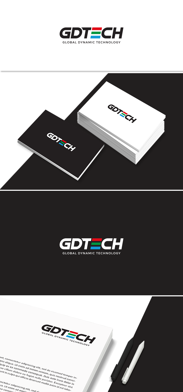
Slight Logo Adjustment
Want to win a job like this?
This customer received 183 logo designs from 44 designers. They chose this logo design from GBDESIGN as the winning design.
Join for free Find Design Jobs-
 US$250
-
 183 designs
-
 44 designers
Logo Design Brief
We are looking to change the our logo slightly. We are having an issue with the CH at the end of our logo. We dont like the way it looks. we would like to make it symmetrical with the whole logo. We would like to have you to submit different arrangements of our logo trying to fix the issue. I submitted two arrangements of the logo and we dont like either option. Also, an update, we're noticing that the "T" may be an issue because it doesnt look like a "T". Can you please resubmit your ideas with a new "T" design. We are struggling to see the word TECH in our name because it is not distinct. But we do like the concept of our logo, if you can give us new submissions with the updated requests.
Updates
Need a couple of days before selecting a winner
Look and feel
Each slider illustrates characteristics of the customer's brand and the style your logo design should communicate.