Romanescos Logo NGO non-binary queer
Winner
Want to win a job like this?
This customer received 97 logo designs from 20 designers. They chose this logo design from Gree™ as the winning design.
Join for free Find Design Jobs- Guaranteed
-
 €80
€80
-
 97 designs
-
 20 designers
Logo Design Brief
PLEASE: No letters, not the word Romanescos, not the flag as a flag!
Keep it simple!
Romanescos is a non profit organization bringing together non-binary identifying persons. Becoming more and more politically involved, we need a logo.
www.romanescos.ch
Target Market(s)
Politics, NGO, Queer
Industry/Entity Type
Non Profit
Logo Text
Icon representing the variety in gender identities outside of the binary.
Logo styles of interest
Emblem Logo
Logo enclosed in a shape
Abstract Logo
Conceptual / symbolic (optional text)
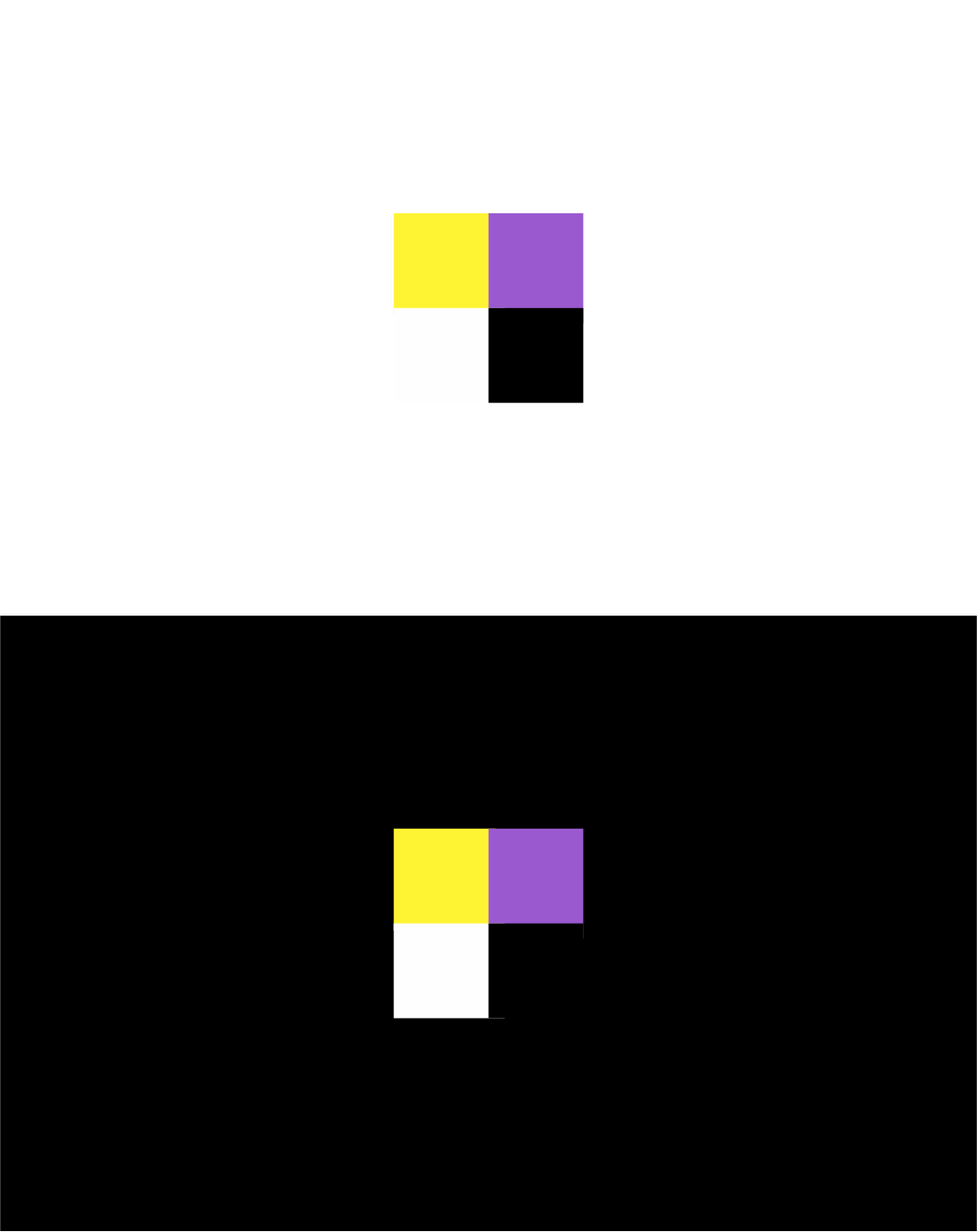
Colors
Colors selected by the customer to be used in the logo design:
ffffff
fbee3e
886aae
Look and feel
Each slider illustrates characteristics of the customer's brand and the style your logo design should communicate.
Elegant
Bold
Playful
Serious
Traditional
Modern
Personable
Professional
Feminine
Masculine
Colorful
Conservative
Economical
Upmarket
Requirements
Must have
- The non-binary flag
- http://gender.wikia.com/wiki/Nonbinary
- consists of four colors. They must be used in the logo, including black
Should not have
- No shades, no text.
Payments
1st place
€80