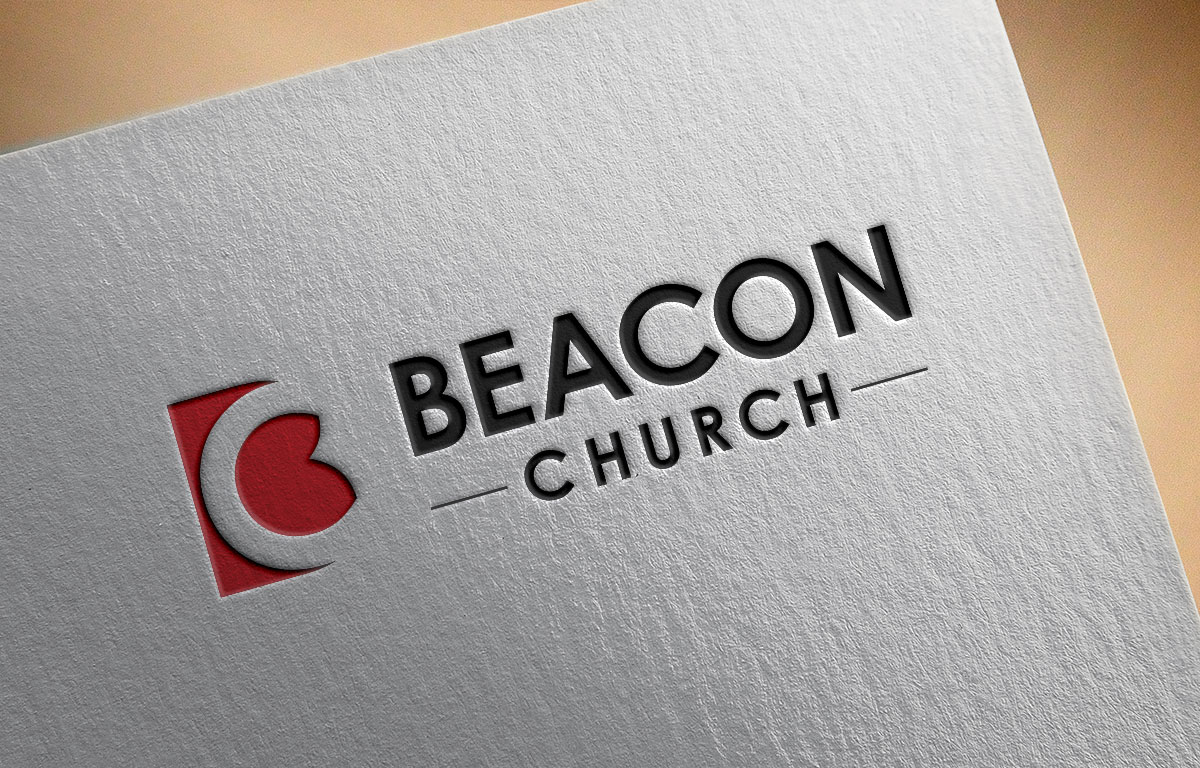
Text Logo with Abstract Icon/Mark for Christian Church on Long Island
Want to win a job like this?
This customer received 170 logo designs from 79 designers. They chose this logo design from Atec as the winning design.
Join for free Find Design Jobs- Guaranteed
-
 US$150
-
 170 designs
-
 79 designers
Logo Design Brief
We need an updated logo for our church on Long Island. We've been around for about 12 years and are continuing to expand. We're a Christian church filled with warm and friendly people who are active in the broader community. It's our joy to bring hope to a frantic and anxiety ridden region of the country. We still like the look & feel of our colors and textures, but our logo really isn't a logo at all. We'd love something that includes text and an identifying icon that will be able to be translated to a whole variety of print and digital media including tents, trailers, brochures, signs & banners, projection screens, web, etc. We want a logo that can be dressed up with color and texture when desired, while still being creative and pleasing in grayscale.
Target Market(s)
Adults 18-60
Industry/Entity Type
Church
Logo Text
Beacon Church
Logo styles of interest
Abstract Logo
Conceptual / symbolic (optional text)
Lettermark Logo
Acronym or letter based logo (text only)
Font styles to use
Other font styles liked:
- We use Montserrat for a lot, but doesn't need to be in Logo
Colors
Colors selected by the customer to be used in the logo design:
Look and feel
Each slider illustrates characteristics of the customer's brand and the style your logo design should communicate.
Elegant
Bold
Playful
Serious
Traditional
Modern
Personable
Professional
Feminine
Masculine
Colorful
Conservative
Economical
Upmarket
Requirements
Must have
- Text logo with icon/mark. Creative & interesting, yet simple enough that it can also be translated in b/w and on a small scale. The icon/mark needs to be able to be used with the full "Beacon Church" text, yet be able to stand alone as well.
Nice to have
- It would be nice if the icon/mark somehow incorporates the letter "b" and captures the feel of a beacon going out without being too literal.
Should not have
- It should not be reliant on any gradients or transparencies. Fonts used should be fresh, but not too trendy that they'll feel out of date in a couple years.